Accordion Documentation
Accordions
Display content in a compact manner
Accordions provide a space-saving technique for displaying content on your viewport. Users can explore an overview of topics and then expand accordions as needed to see more information.
Usage
Usability Guidance
- Use accordions only when information doesn’t need to be immediately visible, and you believe additional information will overwhelm users.
- Use accordions to a greater extent on mobile devices to help reduce scrolling.
- Use an icon or label on an accordion to visually indicate more information is available.
- Use an alternate icon or label on accordion to indicate an expanded state.
Further Reading
- Progressive Disclosure (Nielsen Norman Group)
- Accessible accordions & disclosure widgets (The A11Y Project)
Accessibility Requirements
- Treat accordions like headings and buttons. Headings describe the content beneath and buttons denote an interactive state.
- Use
<h3>or<h4>or smaller headings with a nested<button>element. - Only display one load more button per page or differentiate load more button text so screen readers can differentiate for non-sighted users.
- Apply ARIA roles so accordions are tab-able.
- Apply ARIA states to denote open headings and panels.
Do’s and Don’ts
Do’s
- Customize the heading to describe the content nested within each panel.
- Use an icon or text label to visually indicate more information is contained within.
Don’ts
- Don’t nest the primary sections of a page in accordions, nest only the secondary topics.
- Don’t use accordions when additional or related content should have a separate page, due to the length of content or when visibility is needed in navigation and search engines.
Accordion (Desktop)
Anatomy
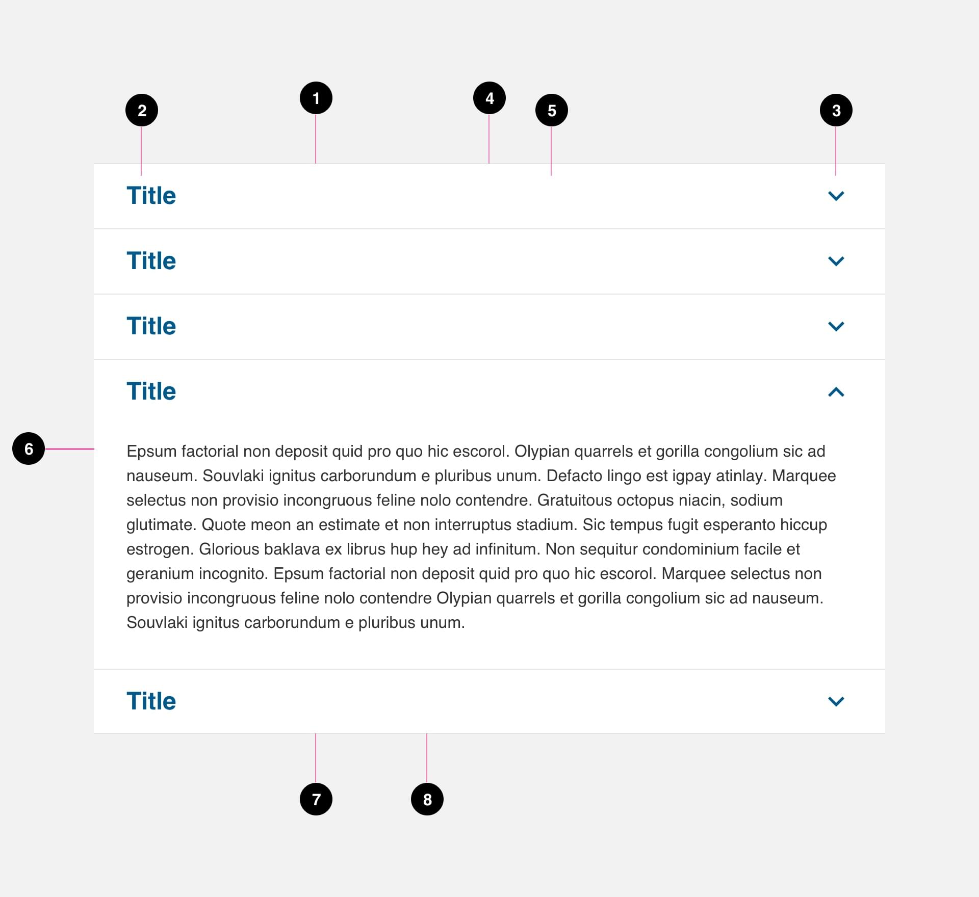
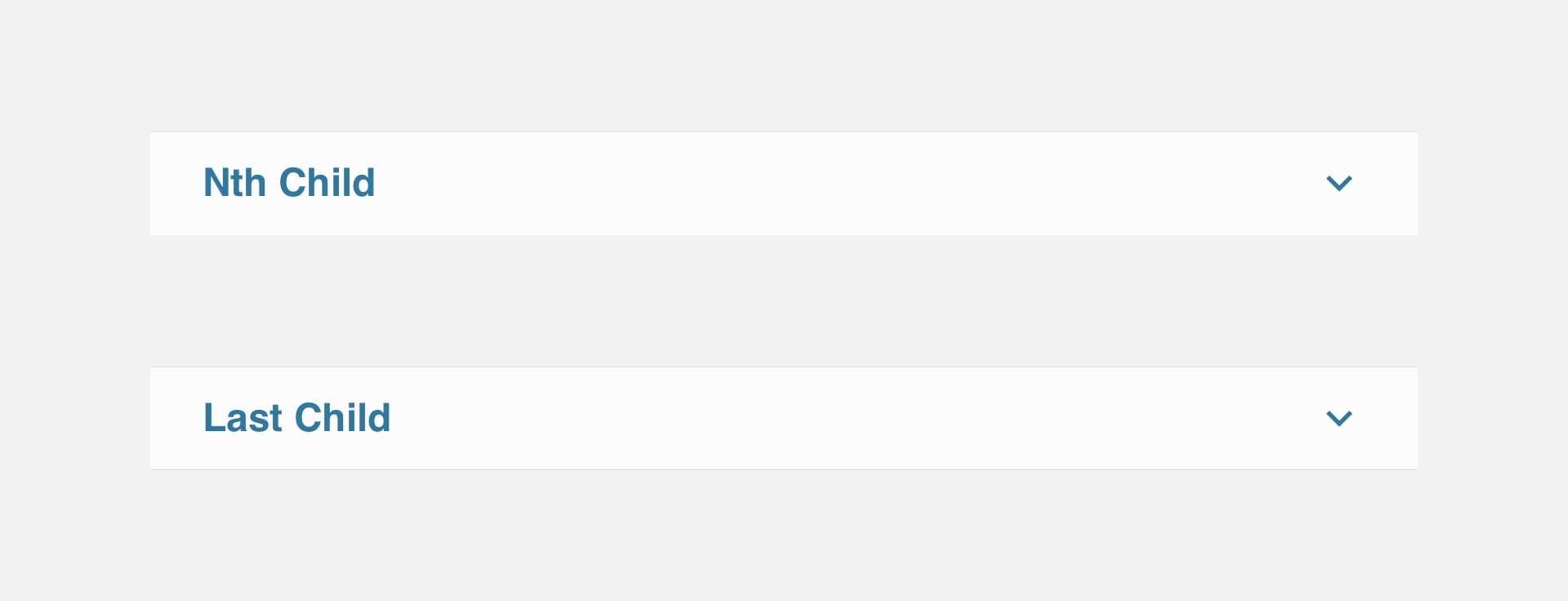
- Accordion - Nth Child
- Title (required)
- Icon (required)
- Top Border (required)
- Container (required)
- Content (required)
- Accordion - Last Child (required)
- Bottom Border (required)
Variations
States
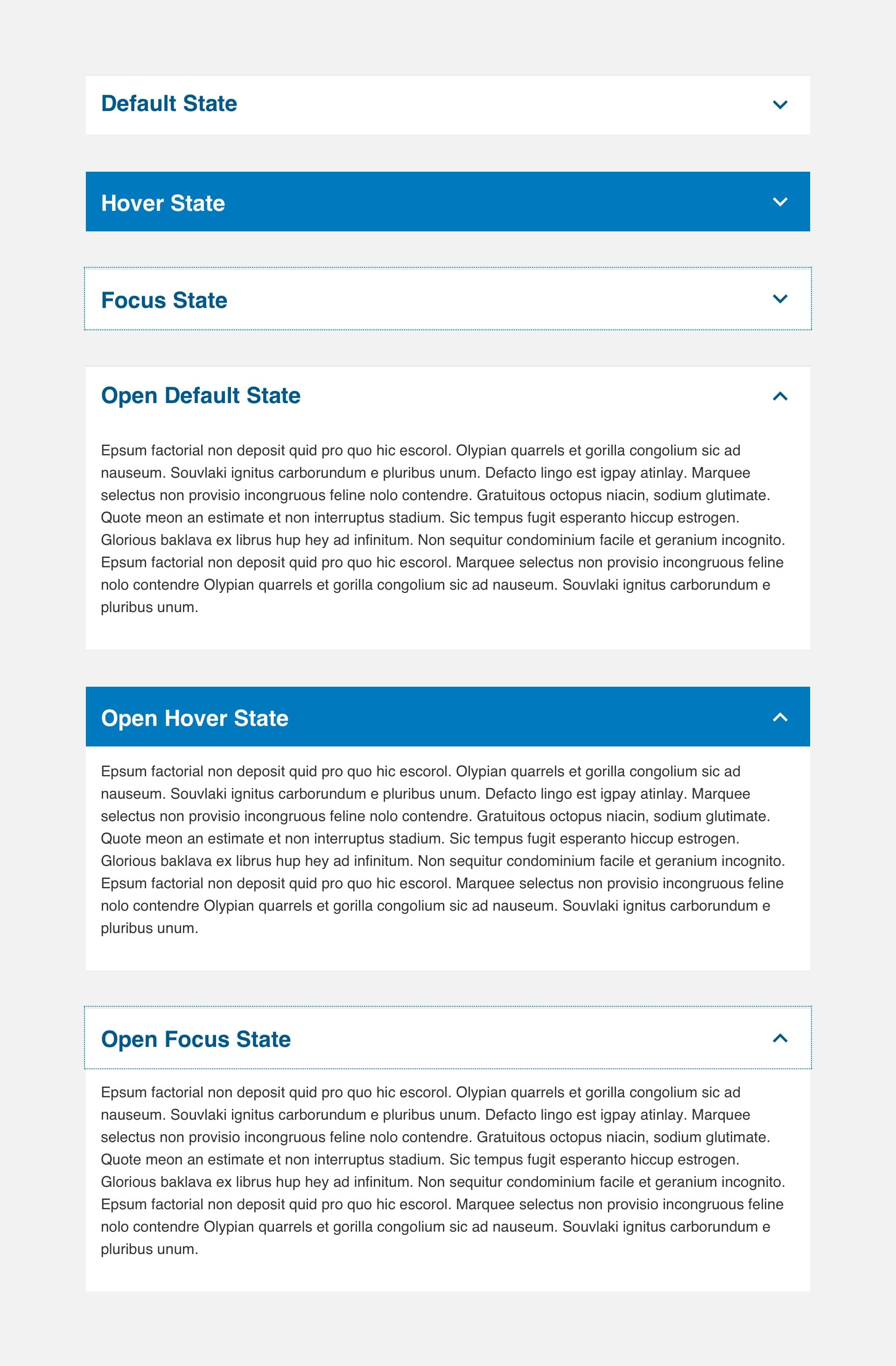
Specs

Accordion (Mobile)
Anatomy
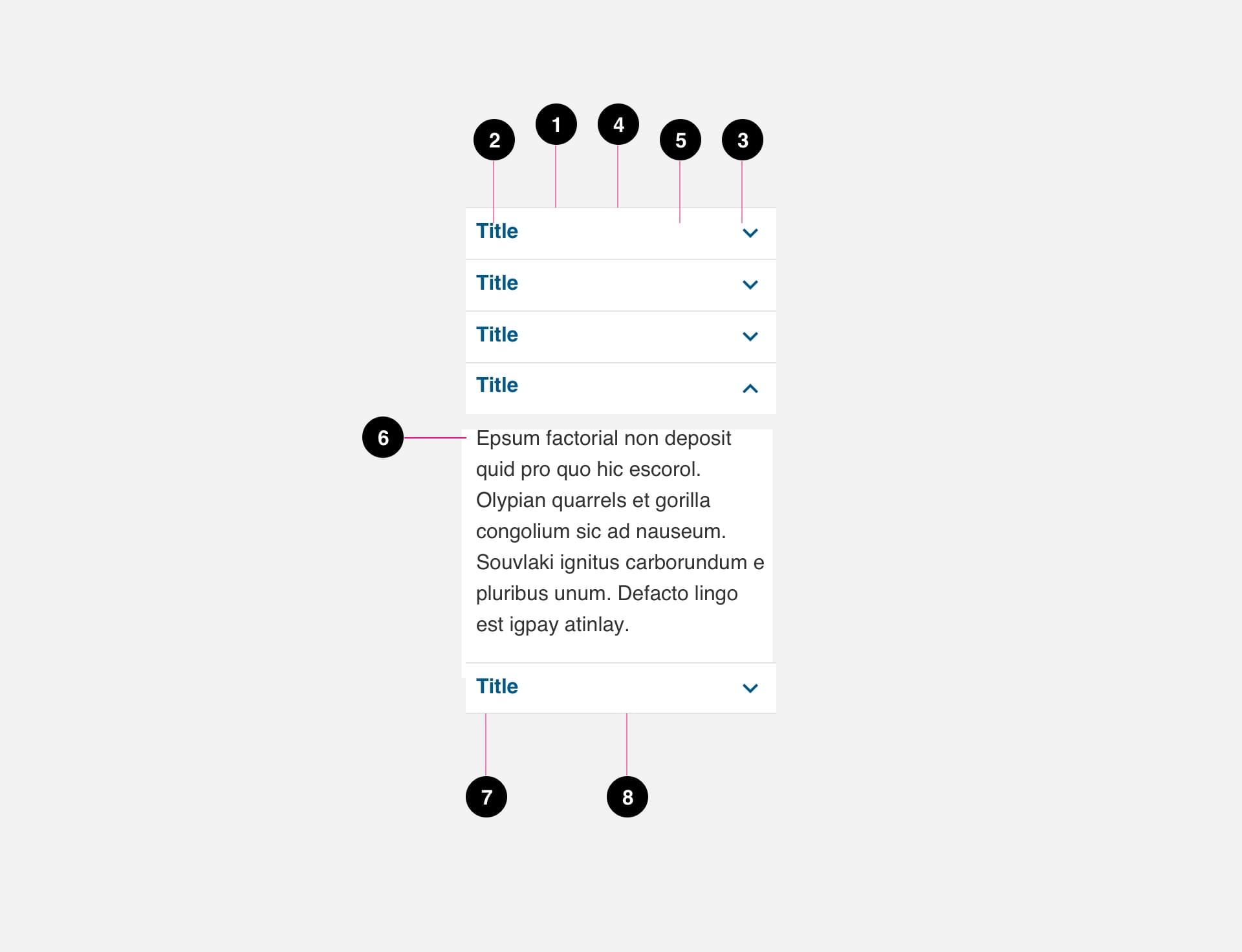
- Accordion - Nth Child
- Title (required)
- Icon (required)
- Top Border (required)
- Container (required)
- Content (required)
- Accordion - Last Child (required)
- Bottom Border (required)
Variations

States
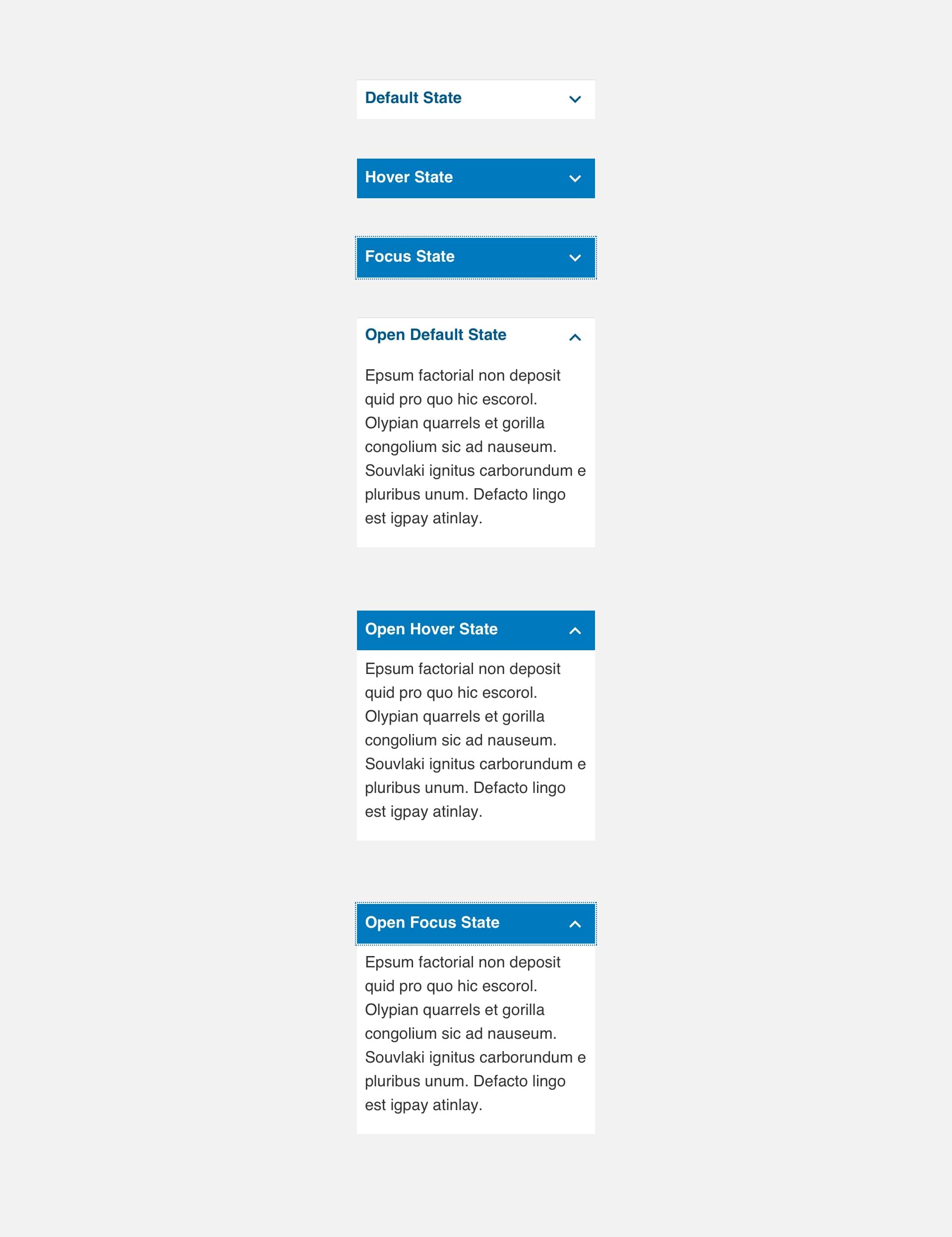
Specs

Code
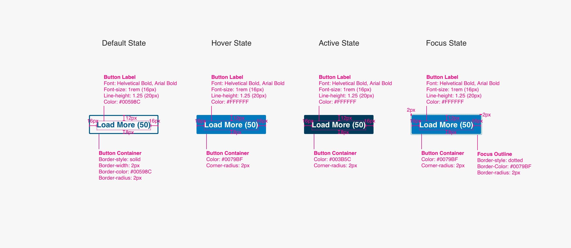
Load More
Use this button to display more content or more items in a list. You should customize the label for accessibility requirements.
Anatomy

- Load More Label (required)
- Load More Number (required)
- Container (required)
States

Specs
