Spacing
Spacing
Introduction
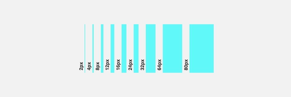
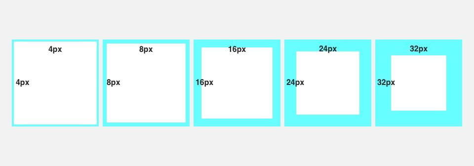
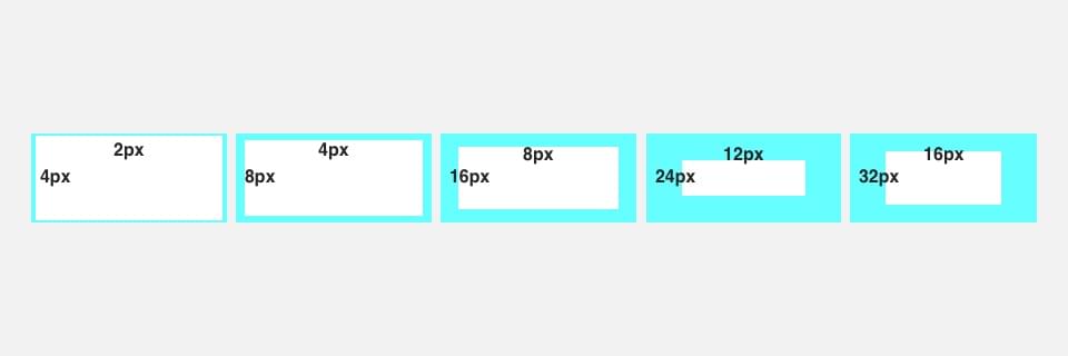
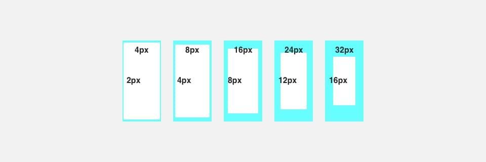
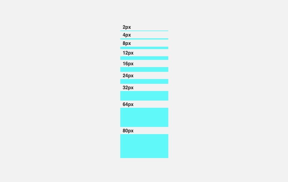
We use an 8-point grid to define our spacing, meaning we use multiples of 8, from 4 to 80. We define dimensions, padding, and margins of both block and inline elements. Individual elements are positioned relative to each other. Smaller components, such as iconography and typography, can align to a 4-point grid.
Specs
Inline Spacing Specs Illustration
Spacing Inset Illustration
Spacing Inset Squish Illustration
Spacing Inset Stretch Illustration
Spacing Stack Illustration
Code
Spacing Class Structure
We created responsive margin and padding classes that use the following shorthand for values. These classes are built from a default Sass map in multiples of 8, ranging from 4 to 80, and support divs, paragraphs, and HTML5 elements.
Use this format:
{property}{sides}-{breakpoint variable (optional)}-{size}
Class Values
| Property | Sides | SCSS Breakpoint Variable | Size |
|---|---|---|---|
| “m” = Margin | “t” = Top | “xs” | “4” = 4px |
| “p” = Padding | “r” = Right | “sm” | “8” = 8px |
| “b” = Bottom | “md” | “12” = 12px | |
| “l” = Left | “lg” | “16” = 16px | |
| “x” = set both *-left and *-right | “xs” | “24” = 24px | |
| “y” = set both *-top and *-bottom | “32” = 32px | ||
| “64” = 64px | |||
| “80” = 80px | |||
Class Examples
| Class Example | Spacing Size |
|---|---|
| “mb-4” | {Margin}{Bottom}, All Screens, {4px} |
| “ml-xl-4” | {Margin}{Left}, {Extra Large Screens Only}, {4px} 0 Margin on All Smaller Screens. |
| “pr-md-4” | {Padding}{Right}, {Medium Screens and Above}, {4px} 0 Padding on All Smaller Screens. |
Margin Use Example
<!-- Margin Bottom Examples -->
<p class="mb-2">This sentence has 2px of margin spacing below it</p>
<p class="mb-4">This sentence has 4px of margin spacing below it</p>
<p class="mb-8">This sentence has 8px of margin spacing below it</p>
<p class="mb-12">This sentence has 12px of margin spacing below it</p>
<p class="mb-16">This sentence has 16px of margin spacing below it</p>
<p class="mb-24">This sentence has 24px of margin spacing below it</p>
<p class="mb-32">This sentence has 32px of margin spacing below it</p>
<p class="mb-64">This sentence has 64px of margin spacing below it</p>
<p class="mb-80">This sentence has 80px of margin spacing below it</p>
<p class="mb-12 mb-md-36 mb-lg-72">This sentence has 12px of margin below it on small screens, 36px of margin on MEDIUM size screens and 72px on LARGE size screens.</p>
<p>-------------</p>
Padding Use Example
<!-- Padding Bottom Examples -->
<p class="mb-2">This sentence has 2px of padding spacing below it</p>
<p class="mb-4">This sentence has 4px of padding spacing below it</p>
<p class="mb-8">This sentence has 8px of padding spacing below it</p>
<p class="mb-12">This sentence has 12px of padding spacing below it</p>
<p class="mb-16">This sentence has 16px of padding spacing below it</p>
<p class="mb-24">This sentence has 24px of padding spacing below it</p>
<p class="mb-32">This sentence has 32px of padding spacing below it</p>
<p class="mb-64">This sentence has 64px of padding spacing below it</p>
<p class="mb-80">This sentence has 80px of padding spacing below it</p>
<p class="pl-md-32">This sentence has 32px of padding spacing to the left on medium screens and above.</p>
<p>-------------</p>
The Center Class
We have a class called “mx-auto” that horizontally centers fixed-width block-level content. If the content that has display: block; and a set width, our class will set the horizontal margins to auto.
<div class="mt-32 mx-auto" style="width: 250px;">
  <p class="mb-12">Centered element with a margin top of 32px. First child paragraph has a margin bottom of 12px.</p>
  <p>-------------</p>
</div>