Buttons And Links
Buttons and Links
Buttons draw attention to important actions, content or next steps
Usage
Usability Guidance
- Write succinct and specific button text. You can elaborate more with inline text links.
- Begin primary or call-to-action buttons with a verb if you want people to complete a task.
- For longer inline text links, use descriptive language in place of generic links like “Learn More“ or “Click Here”.
- Front-load meaningful keywords in longer, tertiary links or text-only buttons.
Further Reading
- Information Scent: How Users Decide Where to Go Next (Nielsen Norman Group)
- Writing Hyperlinks: Salient, Descriptive, Start with Keyword (Nielsen Norman Group)
- Learn More Links: You Can Do Better (Nielsen Norman Group)
Accessibility Requirements
- Write button labels so they make sense without reading the copy around them so they are accessible to screen readers.
- Don’t write button labels that are generic or not specific to the content being presented.
- Avoid more than one instance of generic text like “Read More”. Screen readers can’t disambiguate multiple buttons with the same or similar text.
- Do use the button color scheme provided. It is ADA compliant.
- Link headlines in Story Cards or Event Cards rather than adding buttons with generic text.
Further Reading
- ARIA button role (Mozilla)
- ARIA button role (W3)
Code
Button Links
If your button links to another page, use the anchor element.
<a href=""></a>If your button submits a form, use the input element.
<input type="submit"></input>If your button controls interaction within a page, use the button element with appropriate ARIA roles or states.
<button aria-pressed="false"></button>Line by Line
Button wrapper that represents self-contained content.
<button class="btn"><button>Span wrapper that represents self-contained content.
<span class="btn-span">Button Copy</span>Primary Button
Do’s and Don’ts
Do’s
- Do use only one primary button per section of content.
- Do group primary buttons with secondary buttons or tertiary buttons.
Don’ts
- Don’t change the color of buttons or button labels.
- Don’t group more than one primary button together.
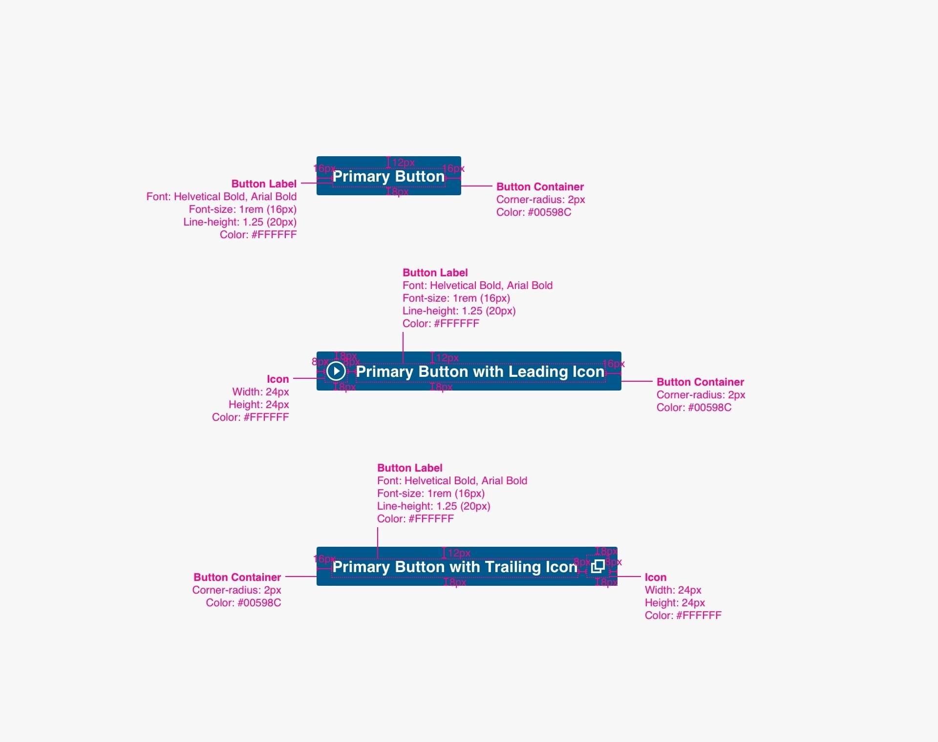
Anatomy

- Button Label (required)
- Container (required)
- Leading Icon (optional)
- Trailing Icon (optional)
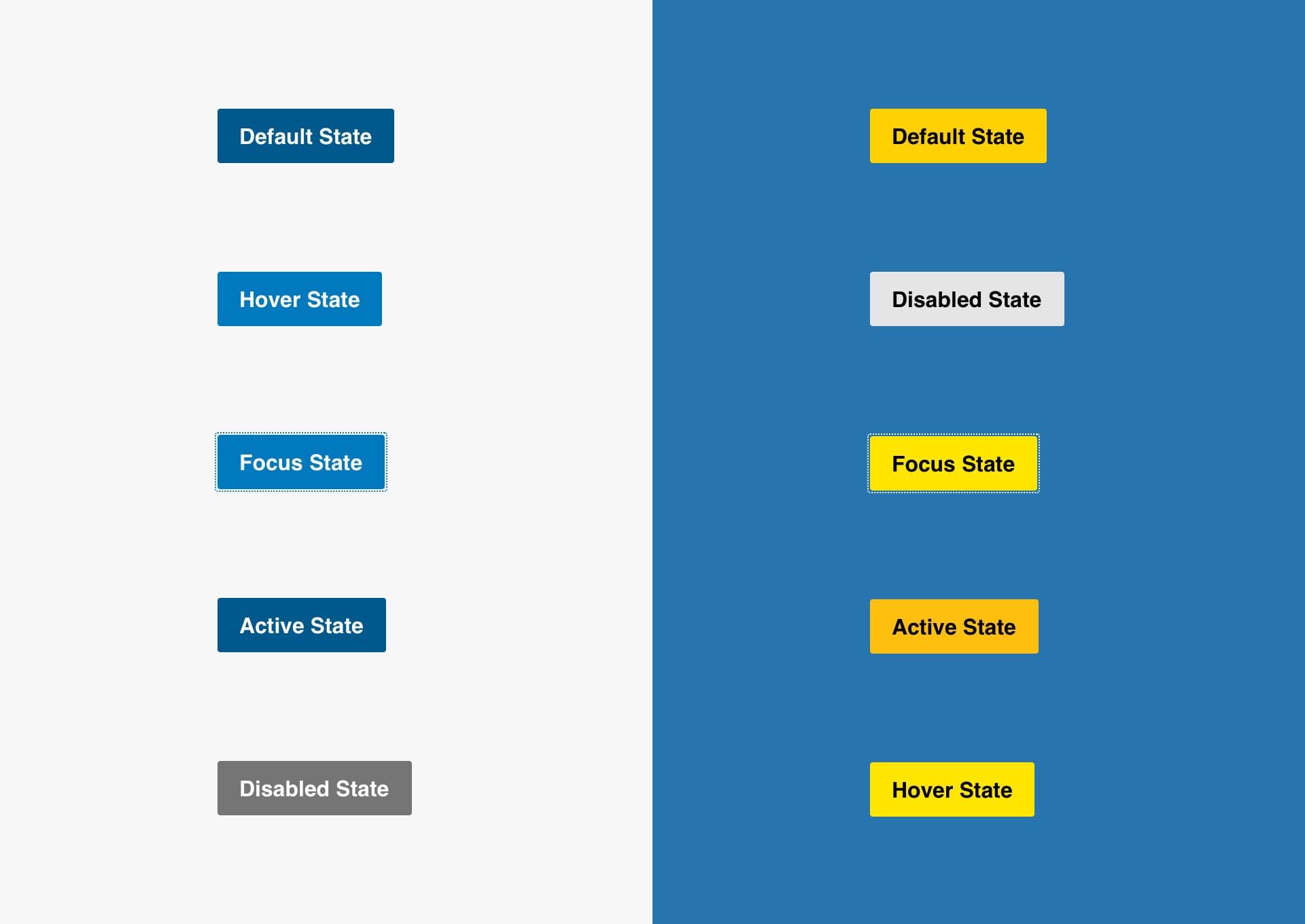
Interactive States
Specs
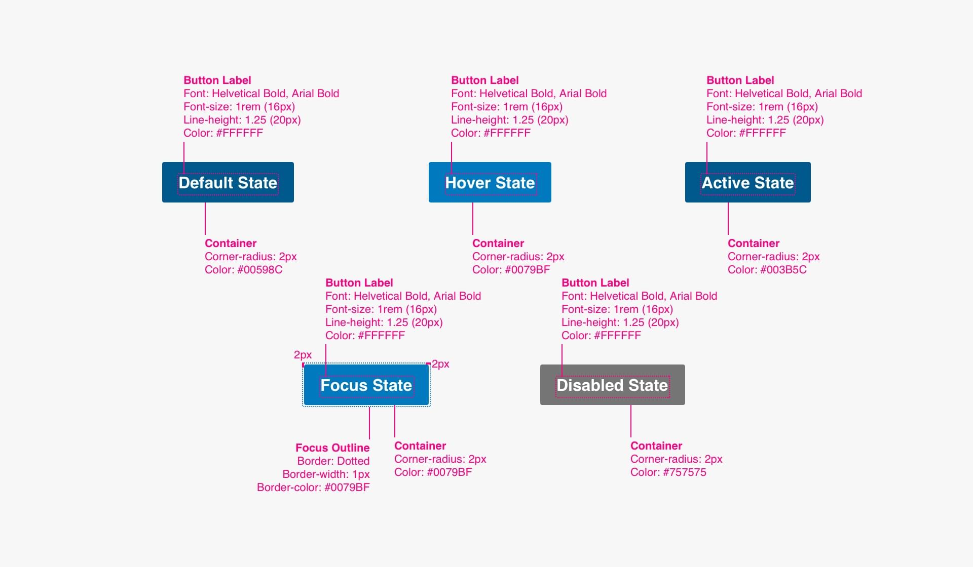
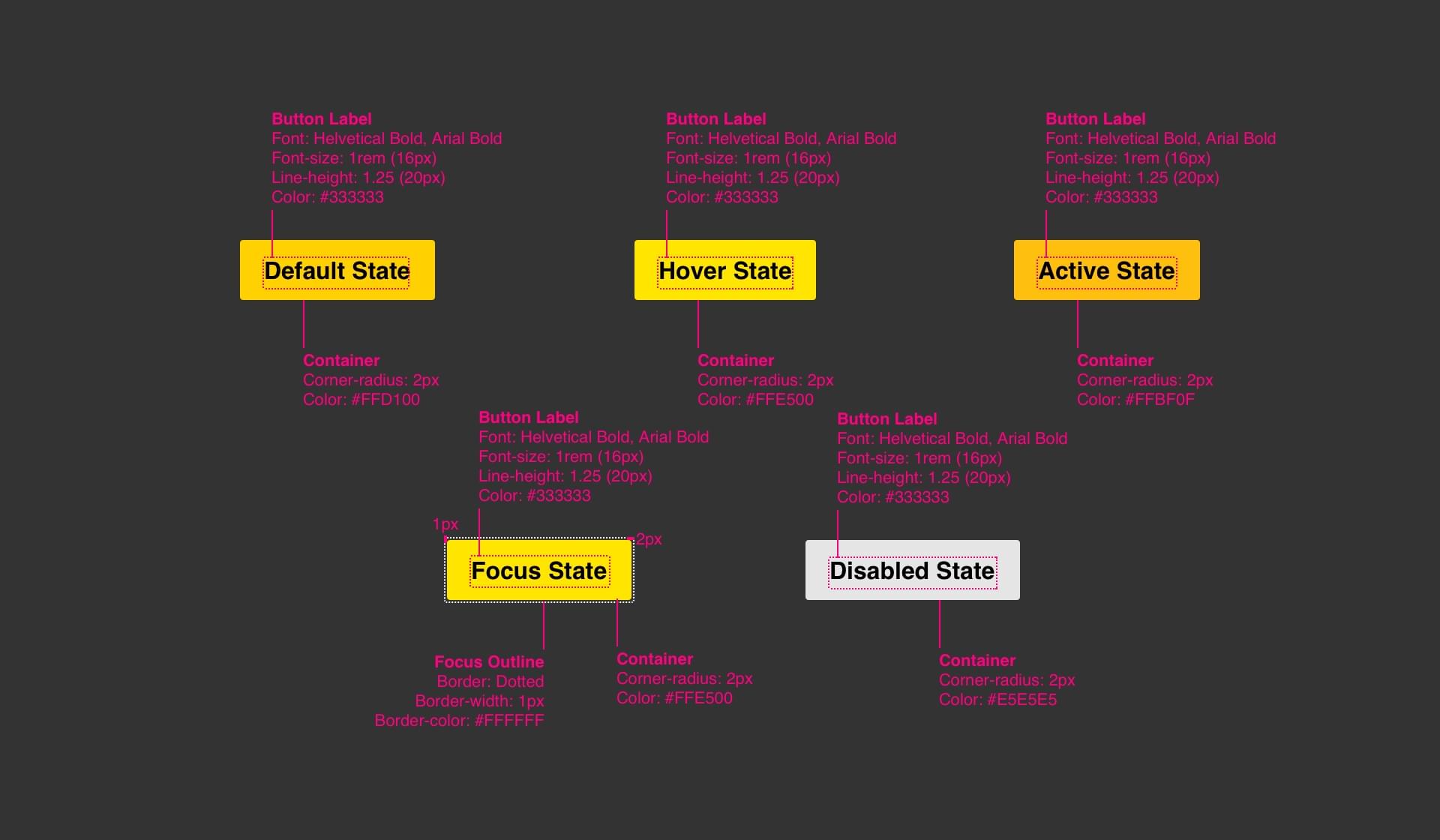
Code
<a href="#" class="btn">Primary Button</a>

<!-- With Icon -->
<a href="#" class="btn icon-btn icon-btn--download">Primary Button</a>
Secondary Button
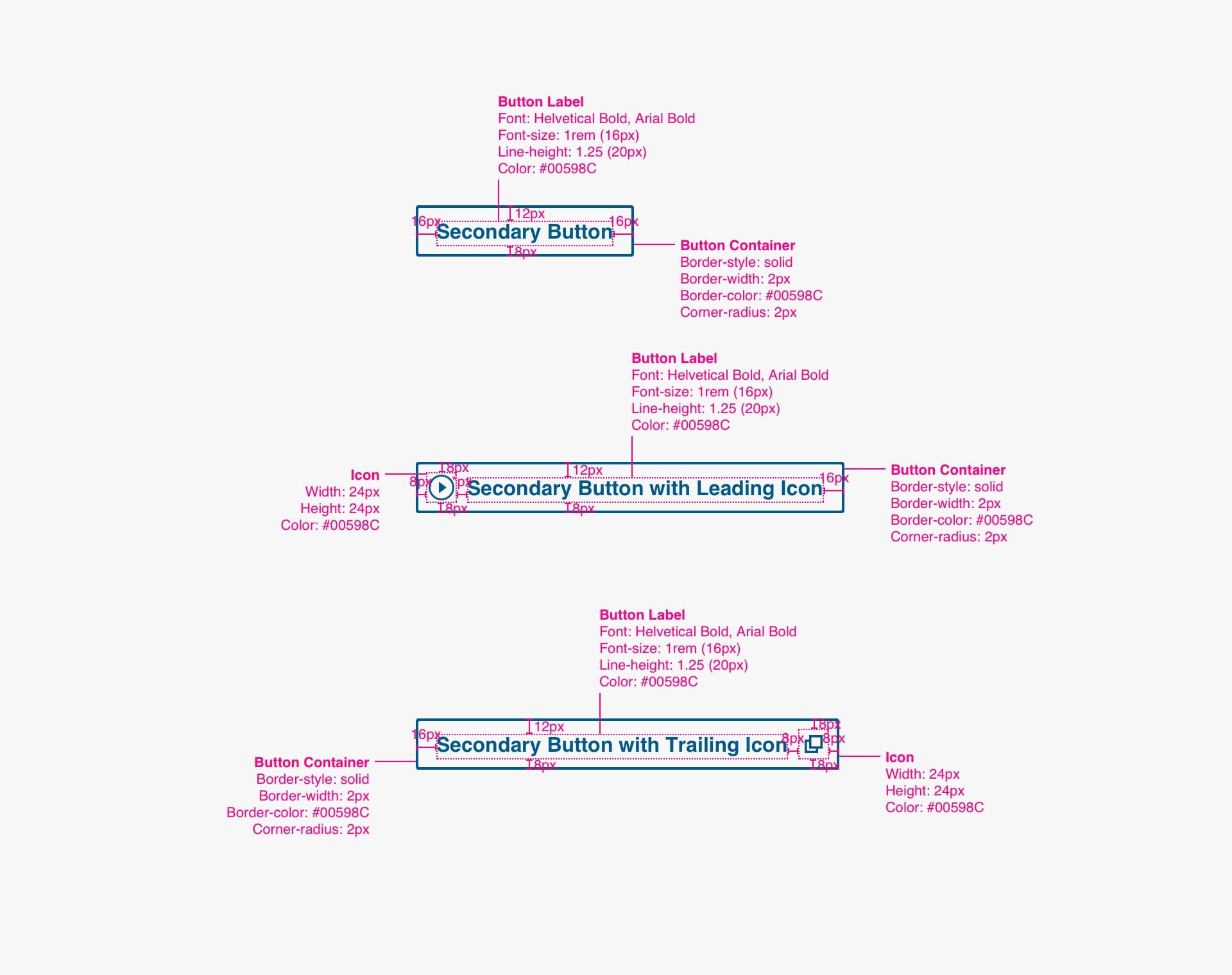
Anatomy

- Button Label (required)
- Container (required)
- Leading Icon (optional)
- Trailing Icon (optional)
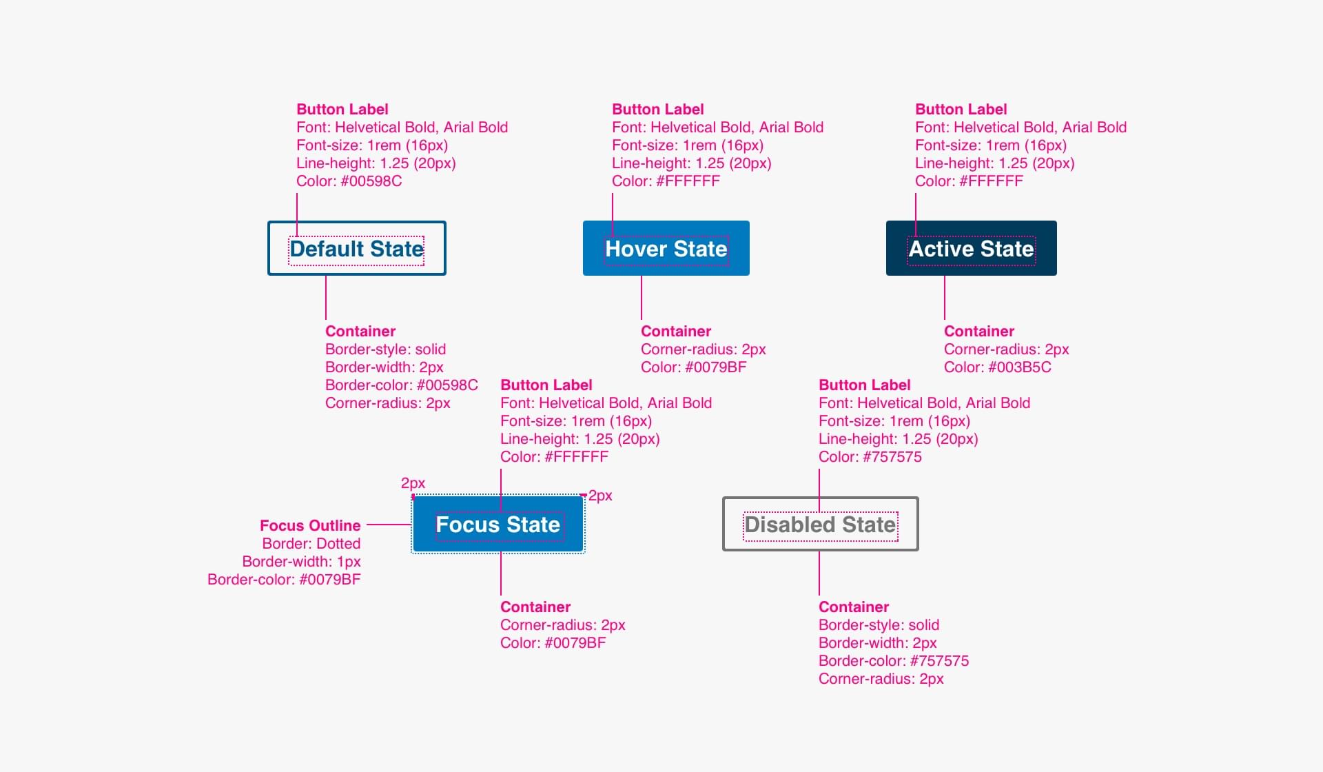
Interactive States

Specs
Code
<a href="#" class="btn btn--secondary">Secondary Button</a>

<!-- With Icon -->
<a href="#" class="btn btn--secondary icon-btn icon-btn--internal">Secondary Button</a>
Tertiary Button
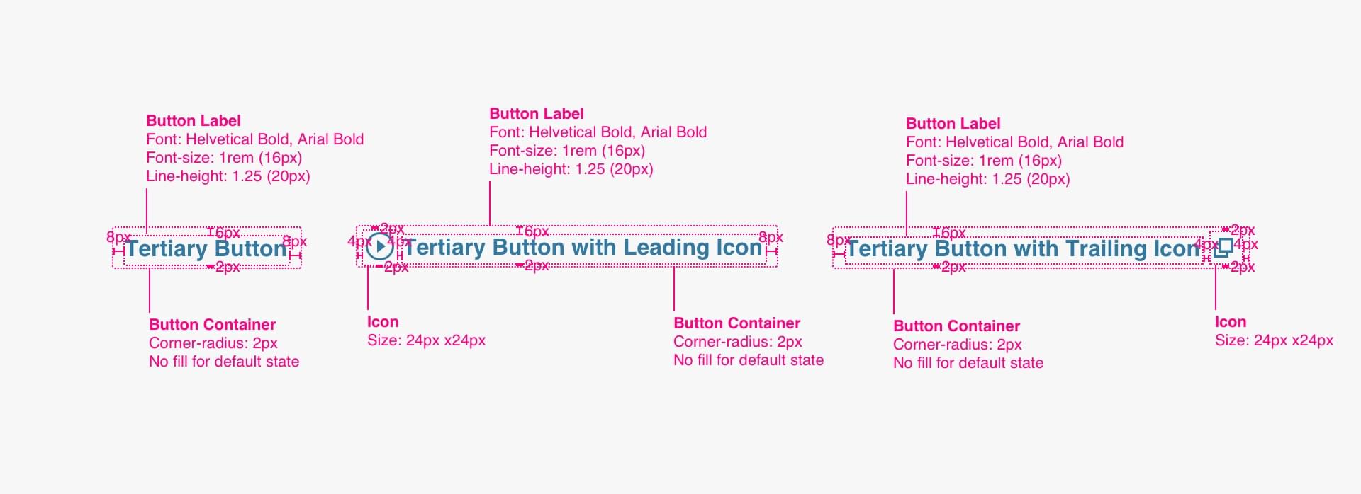
Anatomy

- Button Label (required)
- Container (required)
- Leading Icon (optional)
- Trailing Icon (optional)
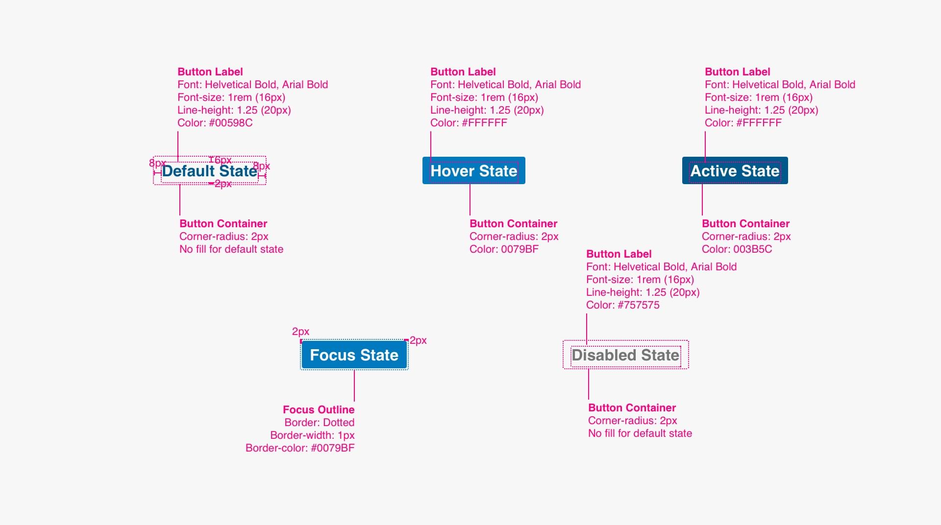
Interactive States

Specs
Code
<a href="#" class="btn btn--tertiary">Tertiary Button</a>

<!-- With Icon -->
<a href="#" class="btn btn--tertiary icon-btn icon-btn--play">Tertiary Button</a>
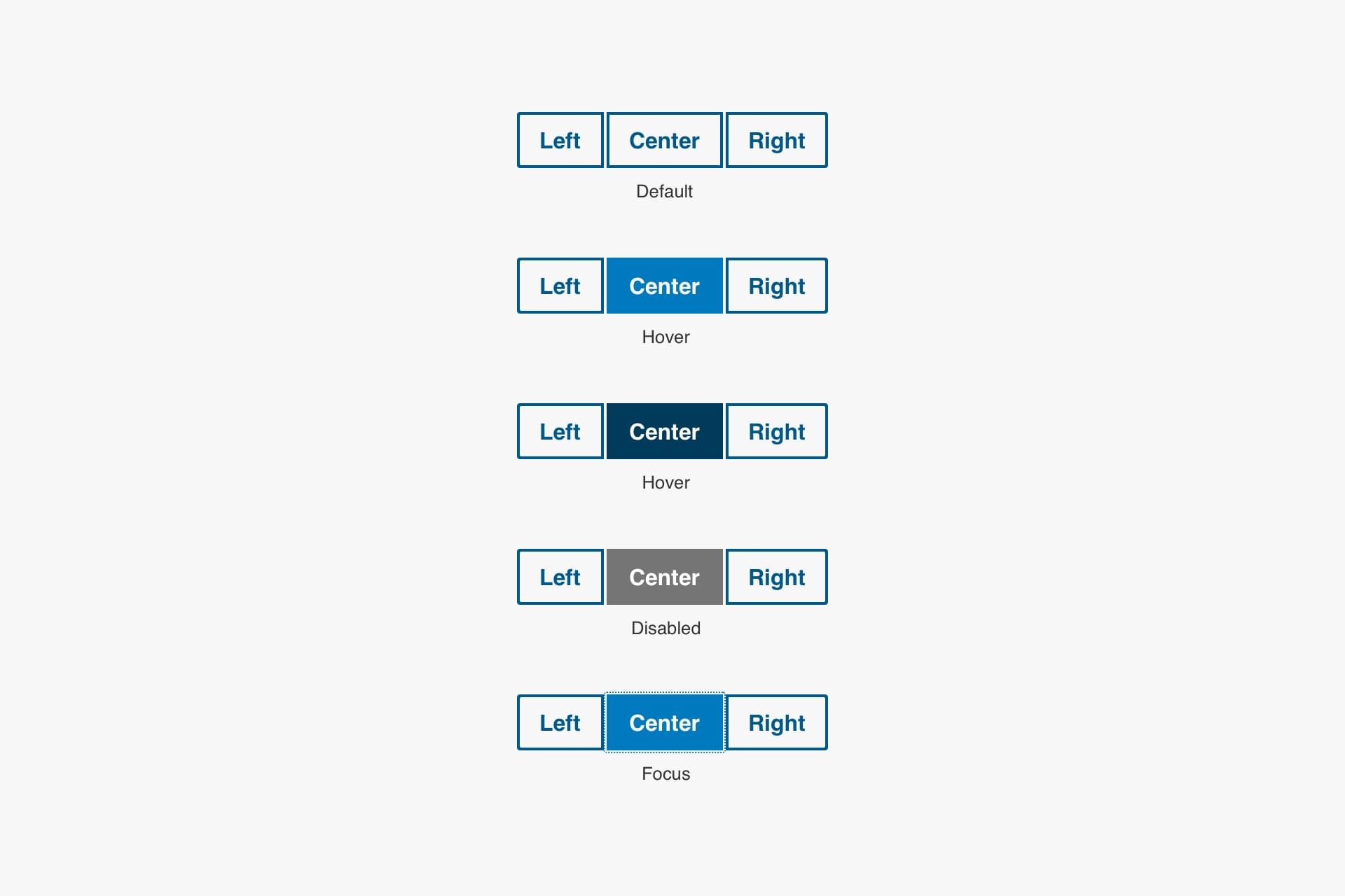
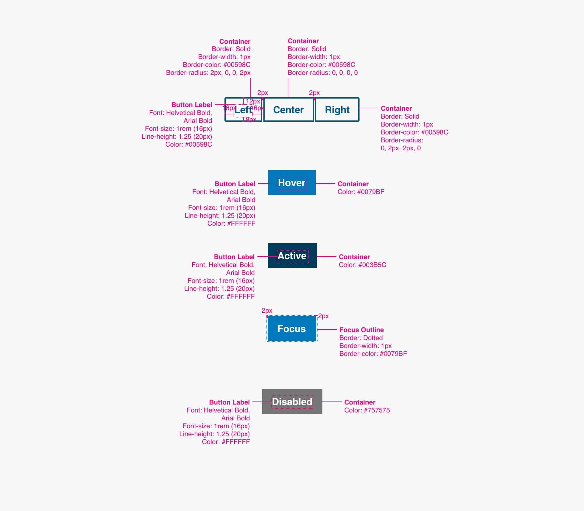
Button Group
Anatomy

- Left Button (required)
- Center Button (optional)
- Right Button (required)
States
Specs
Code
Related Links
Anatomy
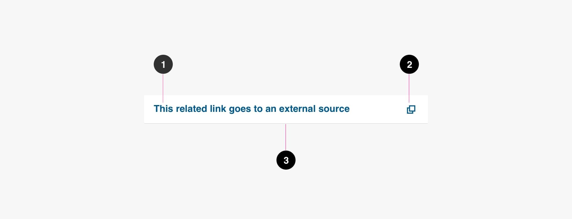
- Button Label (required)
- Icon (optional)
- Container (required)
States
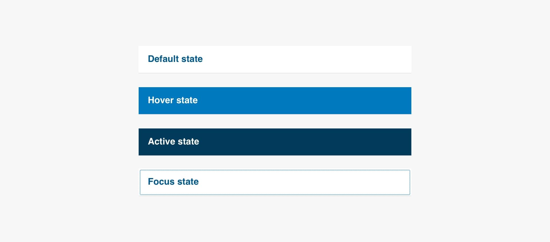
Specs
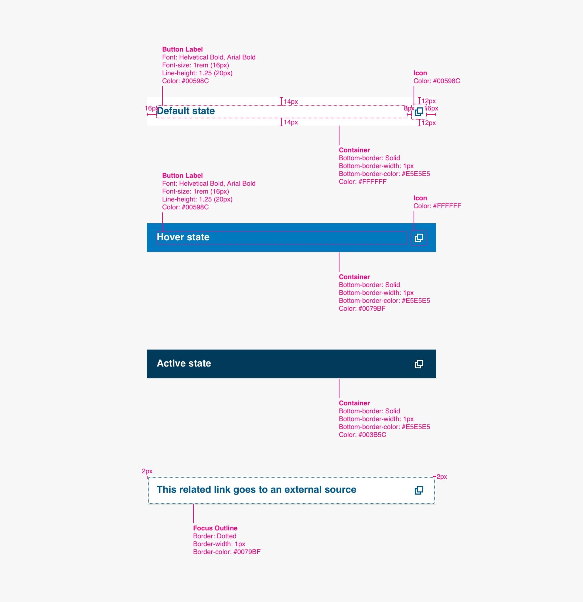
Code
<ul class="list--link-icon ">
    <li><a href="/home" class="icon-link icon-link--internal">This is an Internal Link</a></li>
    <li><a href="http://ucla.edu" class="icon-link icon-link--external">This is an External Link</a></li>
    <li><a href="/sites/all/files/document.pdf" class="icon-link icon-link--download">This is a Link to a Download (pdf)</a></li>
</ul>
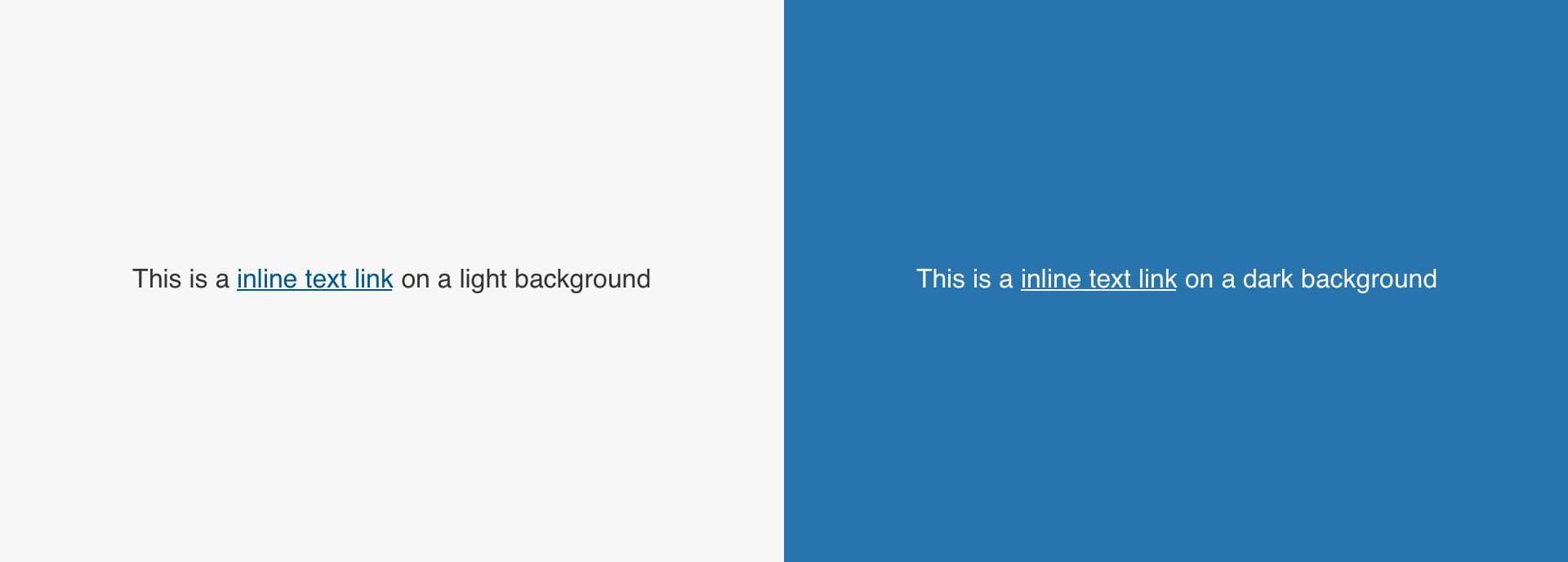
Inline Text Links
Anatomy
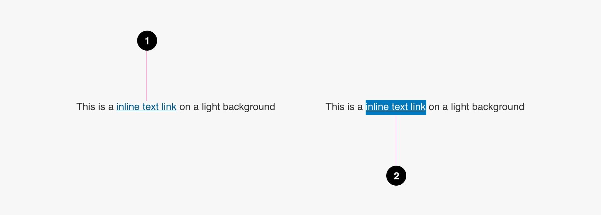
- Link (required)
- Container (on hover and active states only)
States
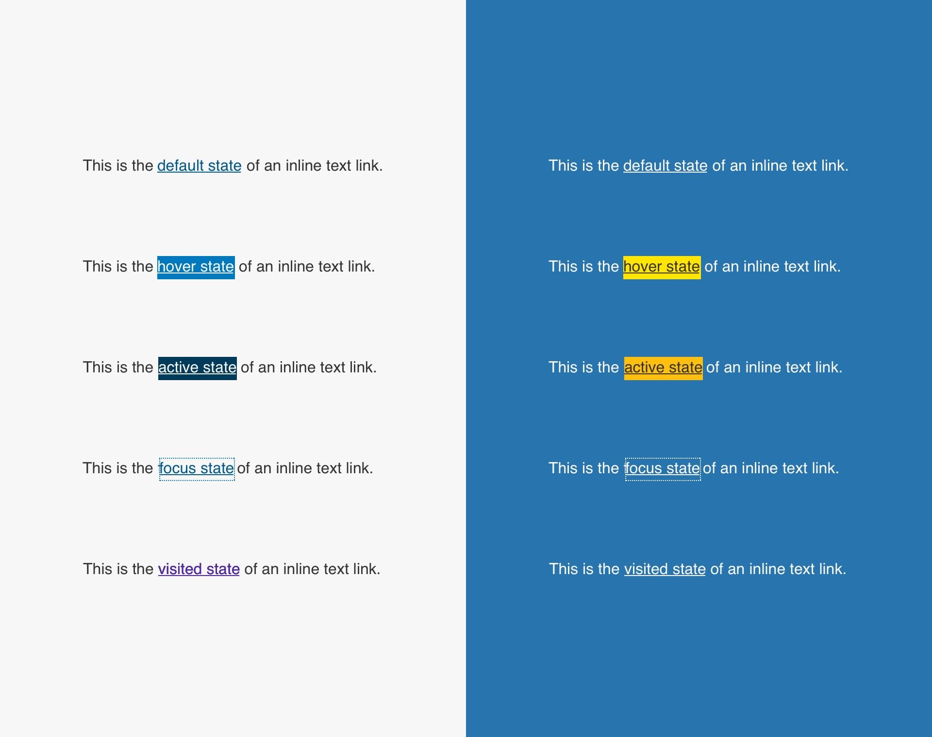
Specs
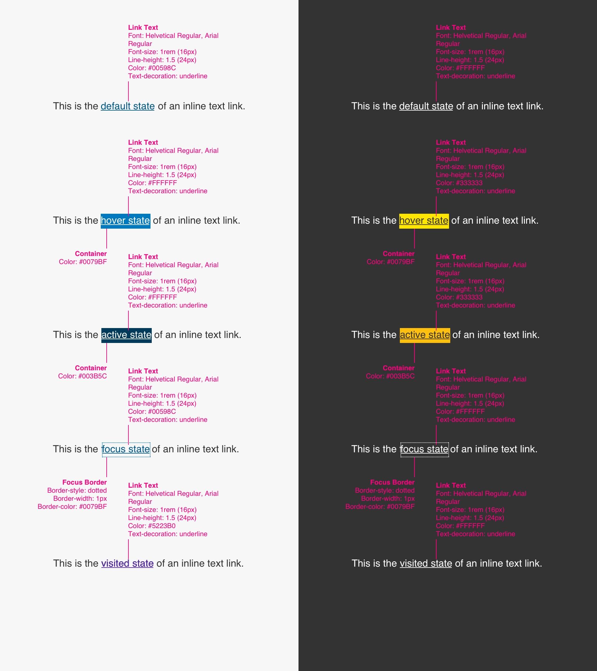
Color Variations
Code
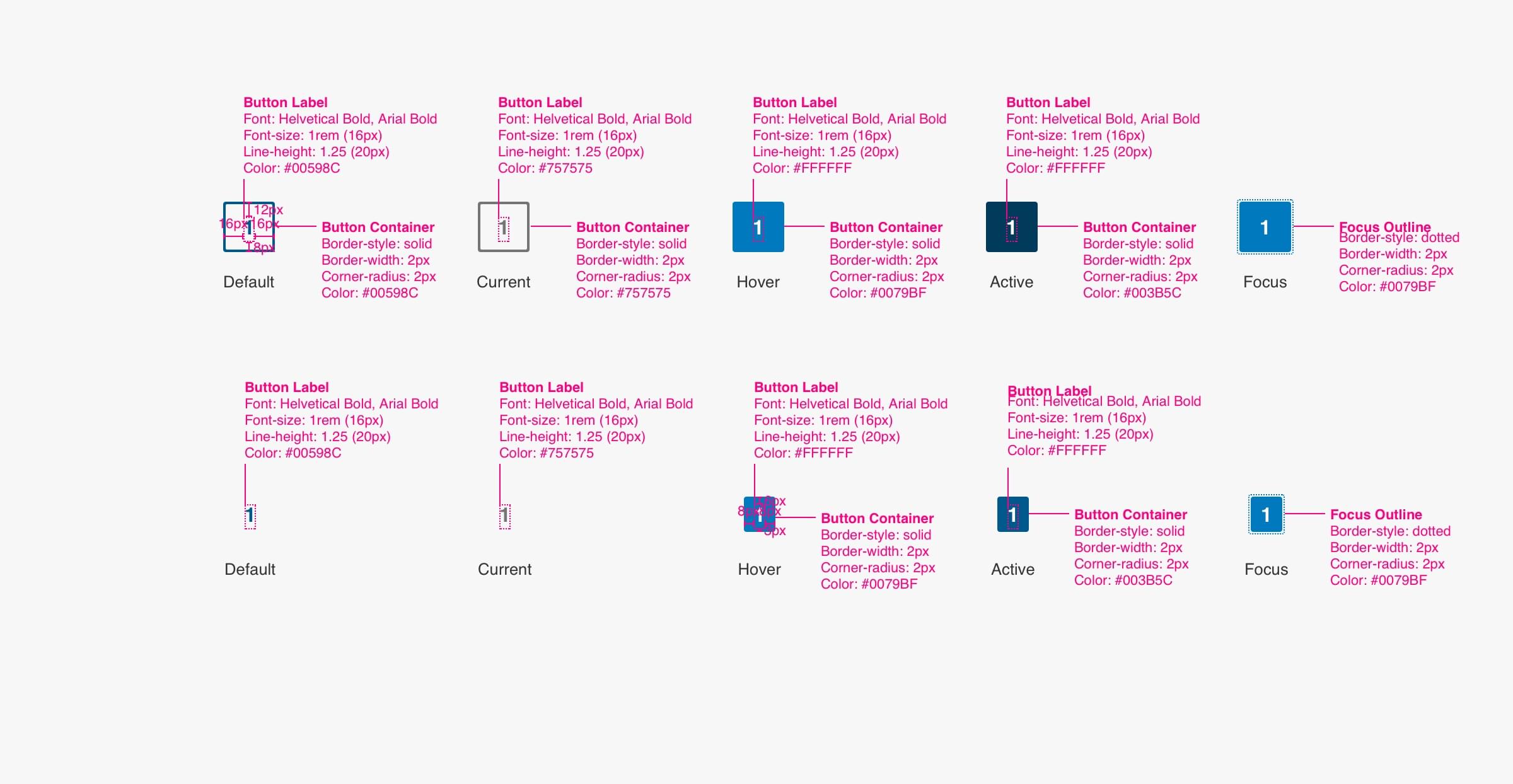
Pagination
Anatomy
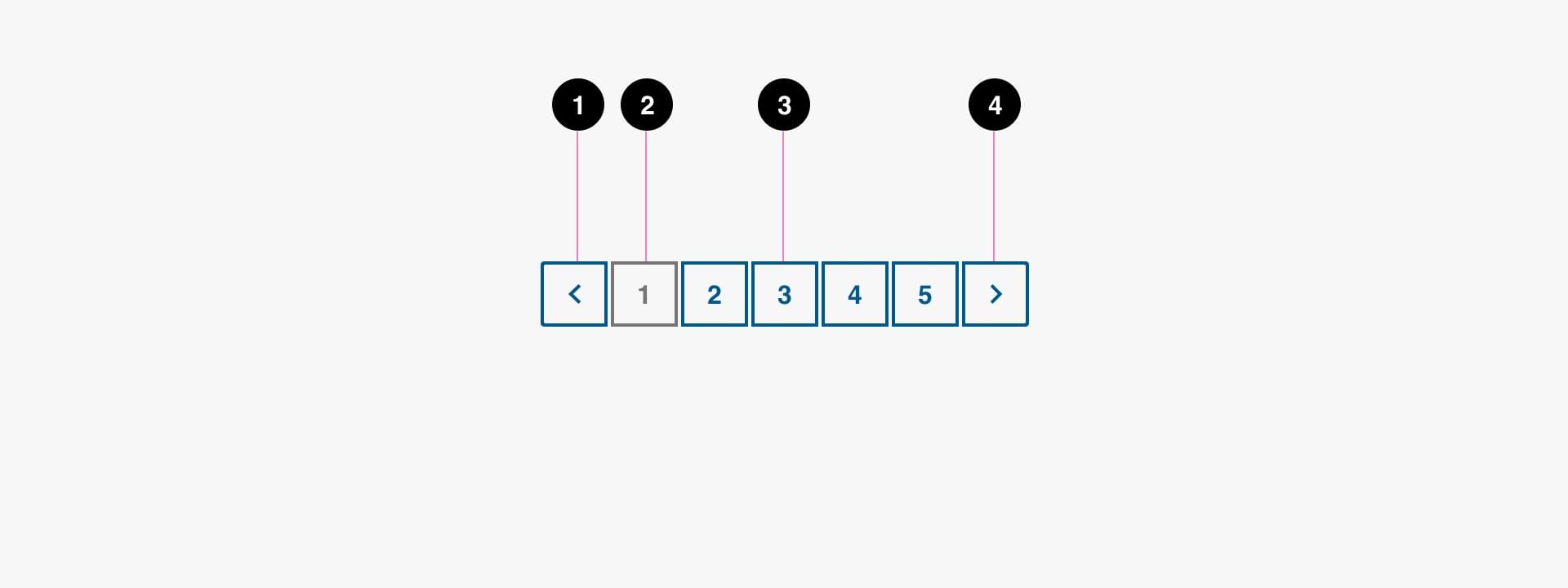
- Previous Page (required)
- Current Page Item (required)
- Page Item (required)
- Next Page (required)
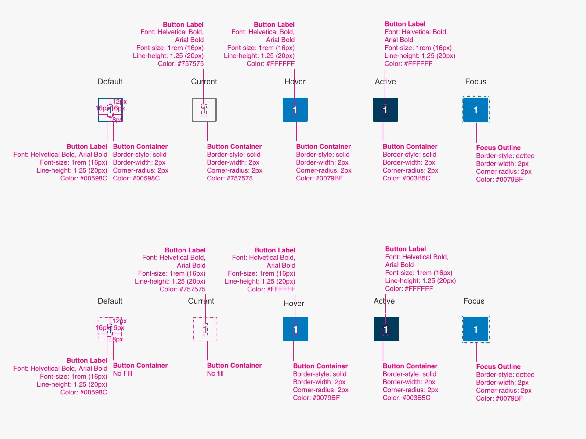
States
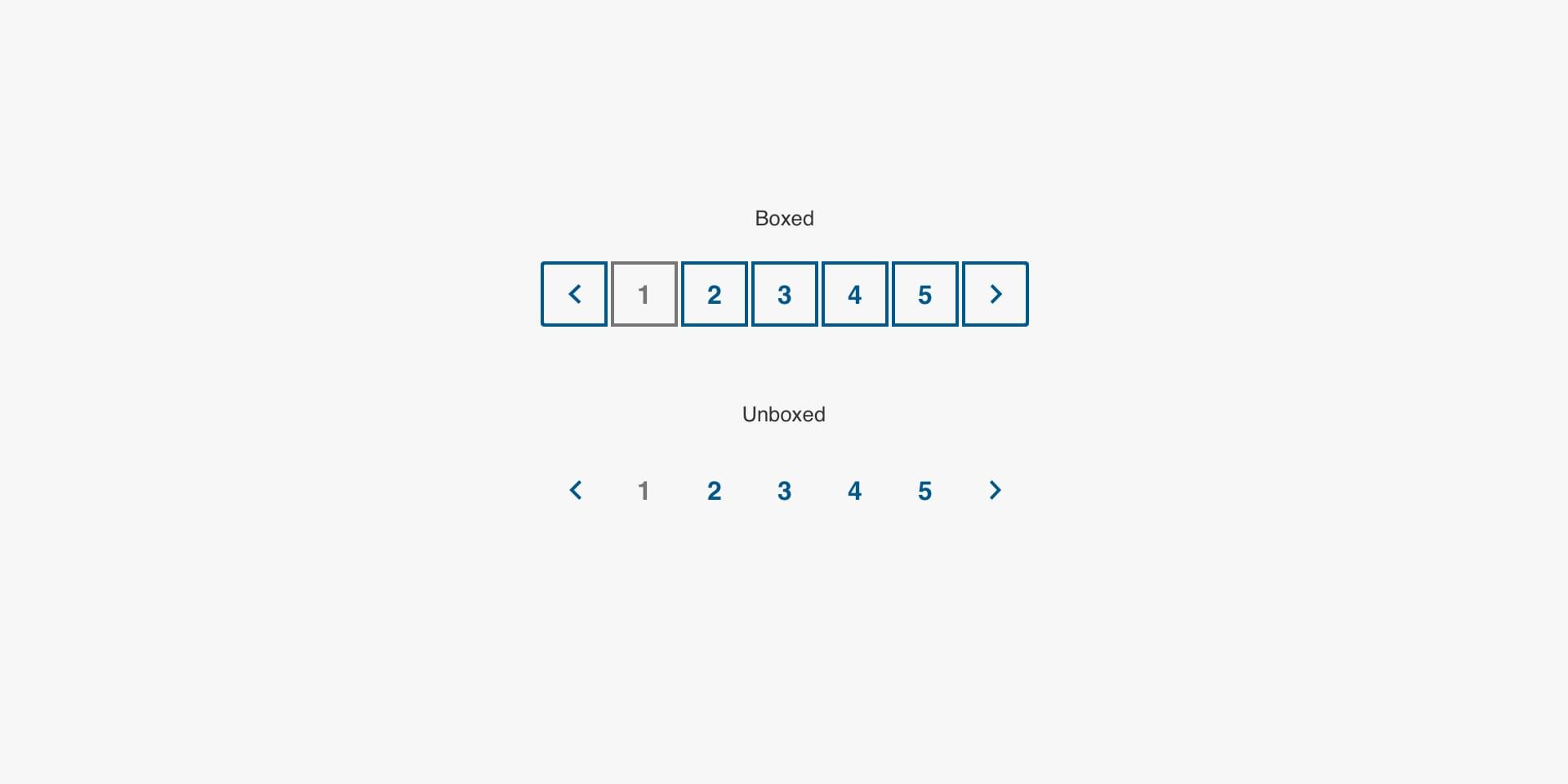
Variations
Specs
Code
<ul class="pager">
  <li class="pager__item pager__prev"><a href="#">« Prev</a></li>
  <li class="pager__item pager__item--current"><a href="#">1</a></li>
  <li class="pager__item"><a href="#">2</a></li>
  <li class="pager__item"><a href="#">3</a></li>
  <li class="pager__item"><a href="#">4</a></li>
  <li class="pager__item"><a href="#">5</a></li>
  <li class="pager__item"><a href="#">6</a></li>
  <li class="pager__item"><a href="#">7</a></li>
  <li class="pager__item pager__next"><a href="#">» Next</a></li>
</ul>