Navigation
Preview and navigate priority topics on your site
Usage
Usability Guidance
- Highlight the primary topics of your website. Help visitors understand what content they can expect to find before they start browsing your site.
- Use succinct labels of 1-2 words in length for each navigation link.
- Use universal language everyone understands.
- Consult web analytics to understand which topics matter most to your visitors.
- Prioritize the needs of site users over internal stakeholders. Navigation is for site users, not your Dean or Vice Chancellor.
- Help people find what they need rather than promoting things they don’t.
- If you need to highlight things like a widely publicized report or conference, do so within the body of your website. Navigation links are intended for evergreen content.
Further Reading
- Navigation: You Are Here (Nielsen Norman Group)
- Information Scent: How User Decide Where to Go Next (Nielsen Norman Group)
- The 3-Click Rule for Navigation Is False (Nielsen Norman Group)
Accessibility Requirements
- Use the
<nav>element and ARIA labels, e.g. “Main”, “Footer”, “Social”, etc., to identify each distinct navigation menu of your site. - Insert a hidden skip nav with quick links to different parts of your site like the main content, navigation menus, search bar, toolbar, footer, etc.
Further Reading
Do’s and Don’ts
Do’s
- Limit main navigation to 4-6 links for easy scanning of website topics. No more than 7 links maximum.
- Avoid acronyms, abbreviation, institutional or technical jargon if it is not widely known by site visitors.
- Stick to broad topics or categories.
Don’ts
- Don’t link to individual reports, articles, events, or people. Use Banners and Cards to highlight editorial content, events, and important people.
- Don’t link to external websites.
- Don’t link to non-web formats like PDF, DOC, etc. These formats do not comply with federal accessibility guidelines by default.
Desktop Anatomy
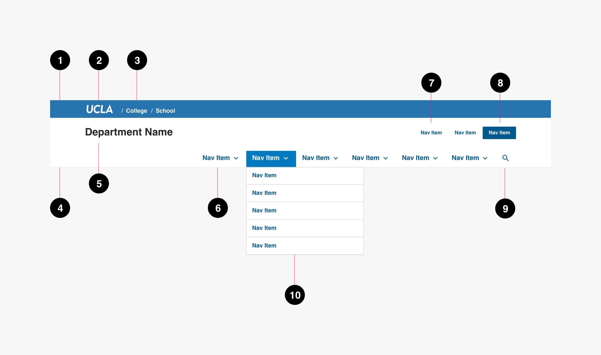
- Global Header (required): Global header includes the UCLA logo and institutional breadcrumb.
- UCLA Logo (required): UCLA logo links back to ucla.edu.
- Institutional Breadcrumb (required): Institutional breadcrumbs are used for academic entities to provide links back to the college, school, or department which the entity falls under.
- Site Header (required): Site header includes entity name and navigation.
- Entity Name (required): Entity name links back to homepage for site.
- Primary Navigation Items (required): Primary Navigation Items link to the main sections of the site. They can be a link to a section landing page or included a dropdown or subpage links.
- Secondary Navigation Items (optional): Secondary Navigational Items callout specific pages that are not within main sections of the site. Limit of 3 items.
- Secondary Emphasized Navigation Item (optional): A Secondary Navigation Item can be given emphasis with this style. Limit this style to one item.
- Search (required): Search navigation item launches the site search function.
- Dropdown Menu (optional): Dropdown menu is used to give access to tier 2 pages.
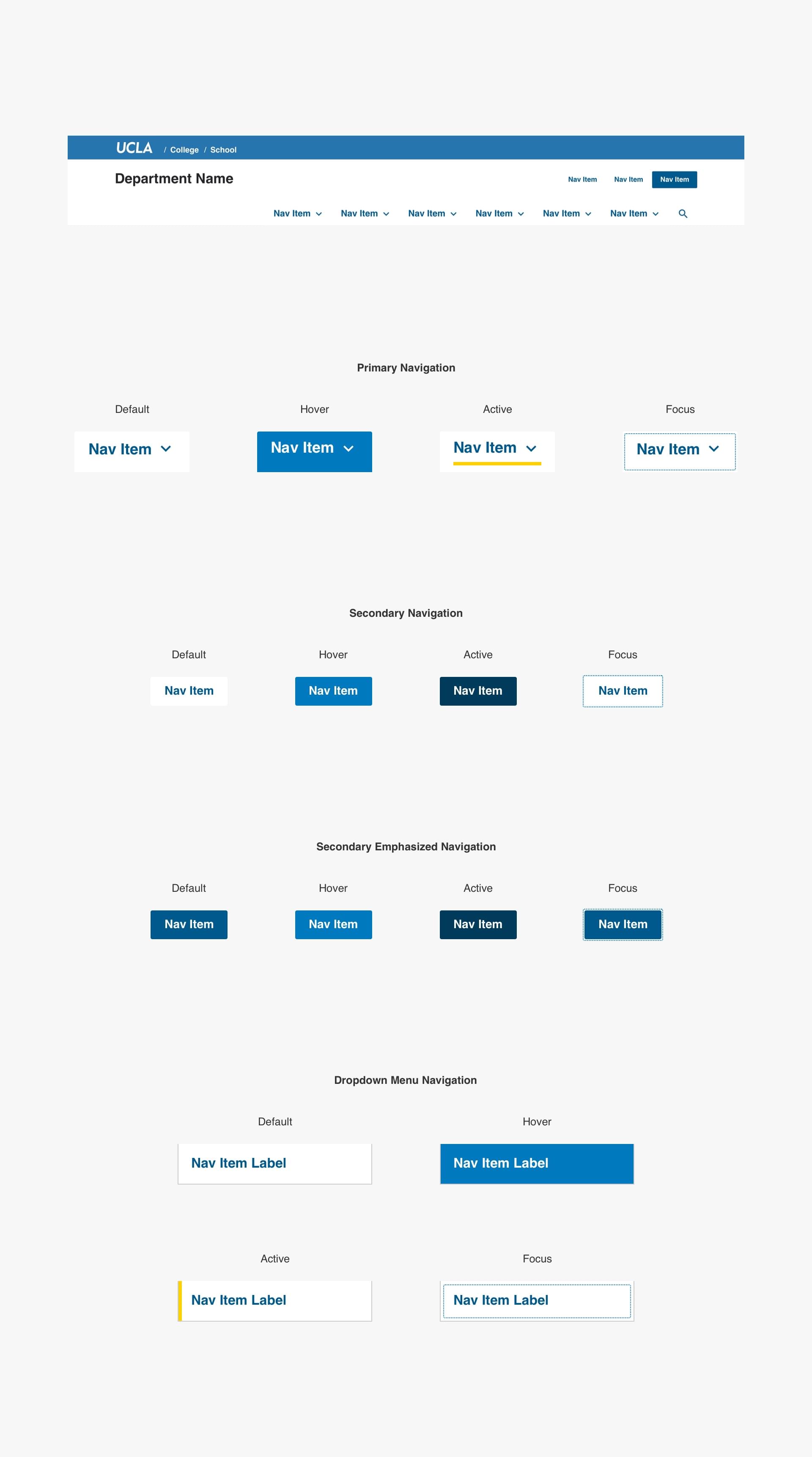
Desktop Variations
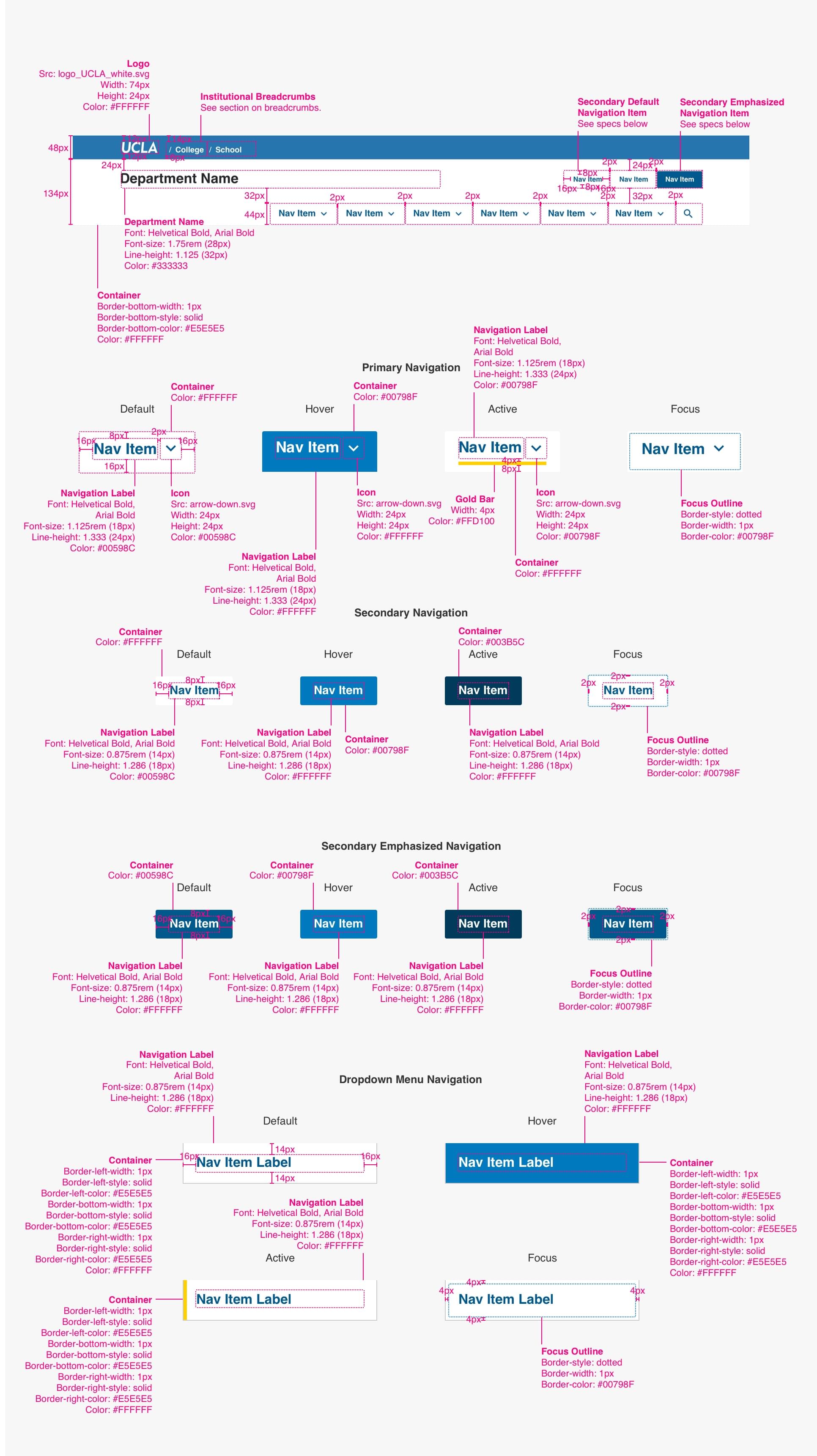
Desktop Specs
Mobile Anatomy
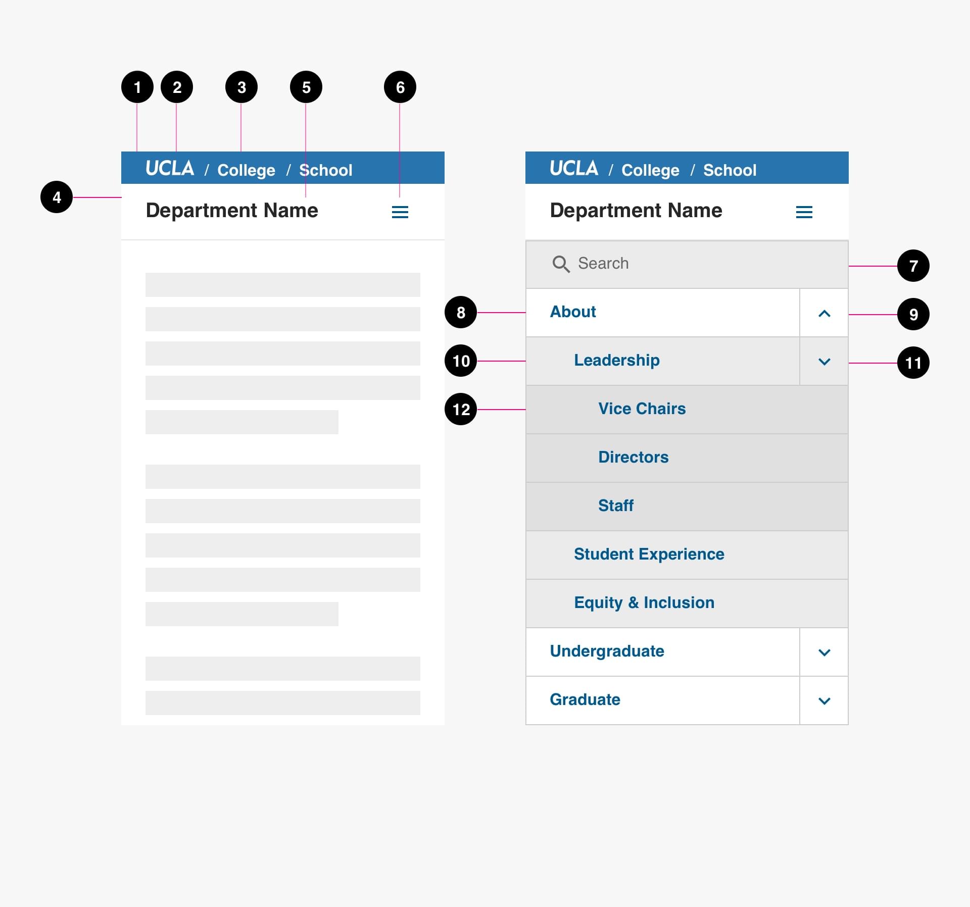
- Global Header (required): Global header includes the UCLA logo and institutional breadcrumb.
- UCLA Logo (required): UCLA logo links back to ucla.edu
- Institutional Breadcrumb (required): Institutional breadcrumbs are used for academic entities to provide links back to the college, school, or department which the entity falls under.
- Site Header (required): Site header includes entity name and navigation.
- Entity Name (required): Entity name links back to homepage for site.
- Primary Navigation Items (required): Primary Navigation Items link to the main sections of the site. They can be a link to a section landing page or included a dropdown or subpage links.
- Search (required): Search field for searching site.
- Tier 1 Navigation Item: Tier 1 navigation Items link to the main sections of the site.
- Tier 1 Dropdown Item: Tier 2 dropdown item reveals tier 2 navigational items.
- Tier 2 Navigation Item: Tier 2 navigation Items link to the subsections of a main section of the site.
- Tier 2 Dropdown Item: Tier 2 dropdown item reveals tier 3 navigational items.
- Tier 3 Navigation Item: Tier 2 navigation Items link to the subsections of a sub section of the site.
Mobile States

Mobile Specs

Code
Breadcrumbs
Breadcrumbs provide an important method of navigating the site. They may feel redundant if your site structure and menus are relatively simple, but they have multiple benefits and require minimal space. We recommend any website with 3 or more levels of page hierarchy (e.g. Home / Academics / Undergraduate) implement breadcrumbs and the wayfinding abilities they provide.
Most visitors will find your site via search engines. If searching for a topic more specific than your program alone, they will likely bypass your homepage to an internal sub-page of your site. Letting visitors know where they entered, and how to navigate upwards to broaden their search, will encourage them to stick around and search for related content.
Anatomy

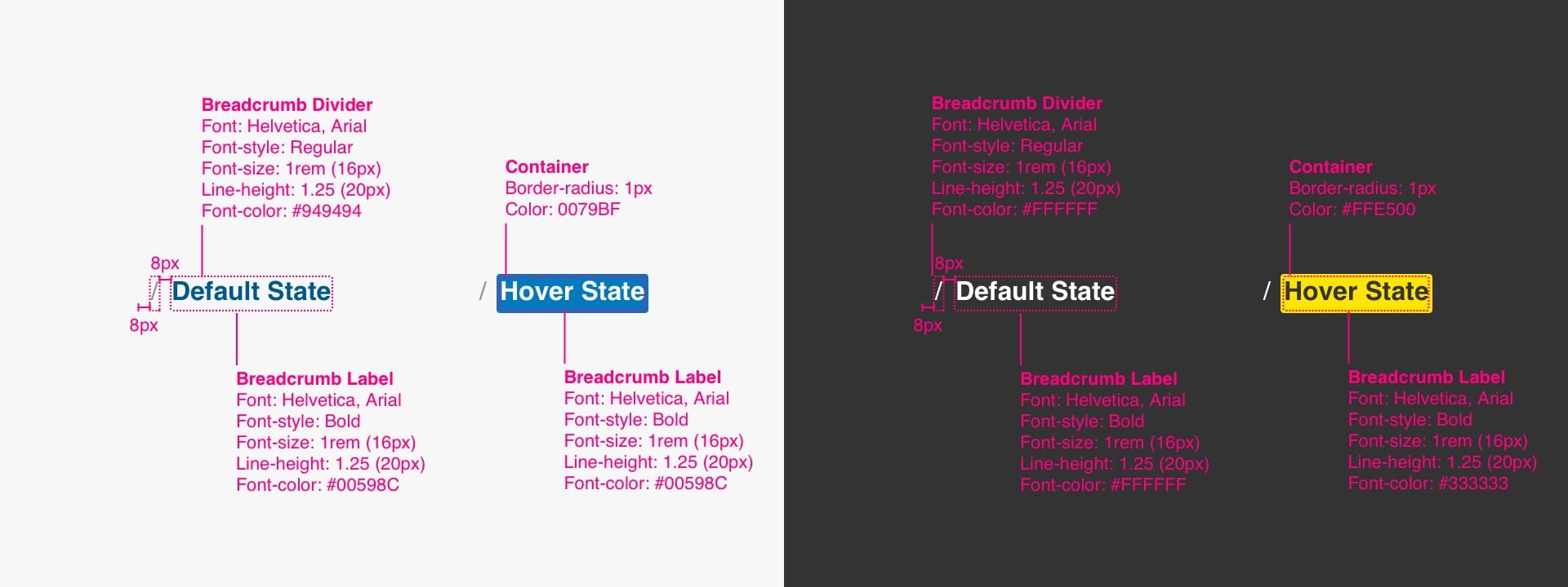
- Breadcrumb Label (required)
- Item Divider (required)
- Container (on hover state only)
States & Variations

Specs
Mobile Behavior
Code
Side Menus
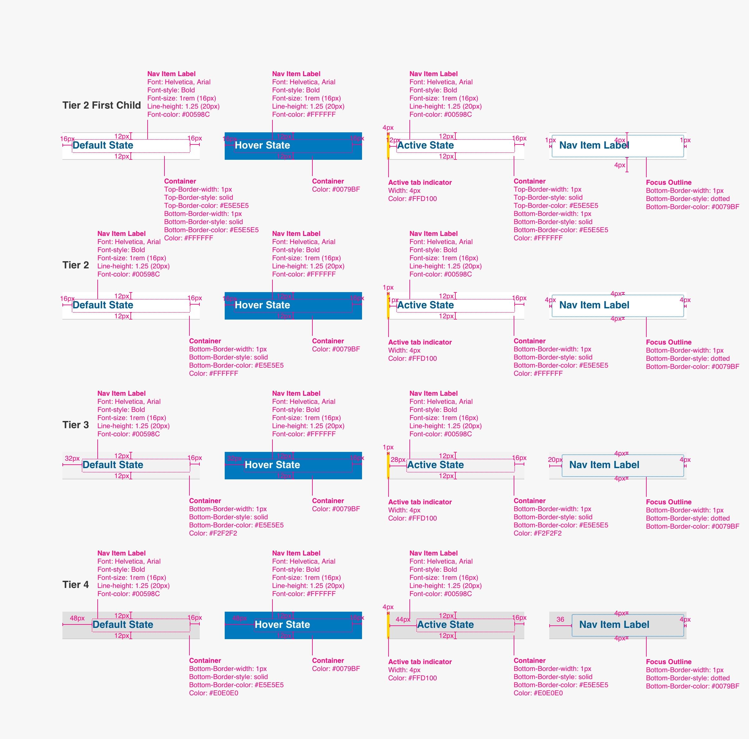
Anatomy
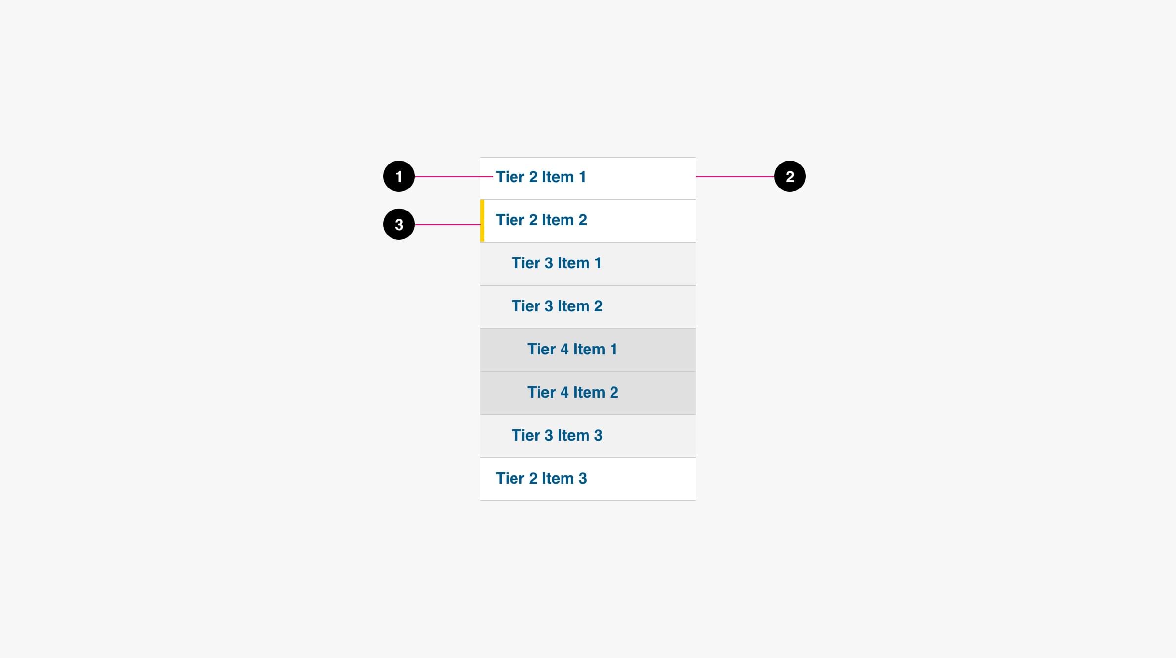
- Nav Item Label (required)
- Container (required)
- Active tab indicator (required)
States

Variations
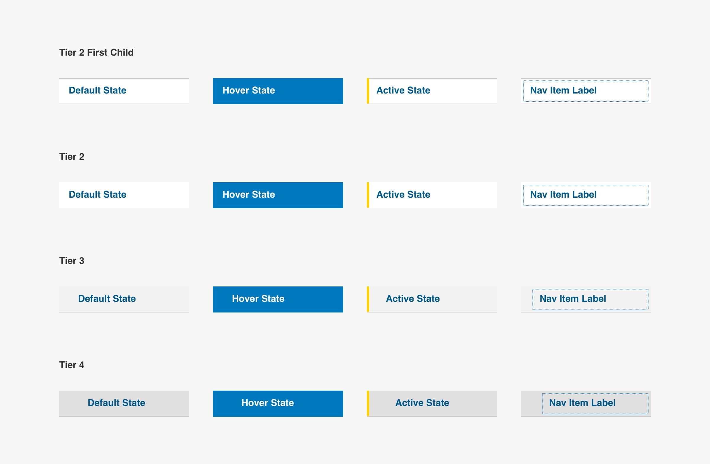
Specs
