Cards
Preview articles, topics, and events in a visual way
Usage
Usability Guidance
- Use plain language when writing headlines and descriptions.
- Avoid technical language, acronyms or jargon people don’t understand.
- Front-load the first 2 words of your headlines for easy eye scanning.
- Limit descriptions below headlines to one sentence or 2-3 lines.
- Use original images rather than stock images to maintain credibility and trust among your users.
Further Reading
- Cards (Inclusive Components)
- 5 Tips for Writing Headlines That Convert (Nielsen Norman Group)
- First 2 Words: A Signal for the Scanning Eye (Nielsen Norman Group)
Accessibility Requirements
- Link the card’s headline, heading or title to provide the most succinct description to screen readers and search engines. Both technologies use links to understand and navigate document structure.
- Wrap your link around the image too if you decide to include one.
- Only use one link per card.
- Write alt text for any images you include.
- Avoid linking from buttons with generic labels like “read more” or “view details”. Screen readers cannot differentiate card topics with the same link text.
Basic Card
Do’s and Don’ts
Do’s
- Do adjust the container color of the card to grey-05 if it’s being used on a white background.
Don’ts
- Don’t adjust the container color to a color other than white or grey-05.
- Don’t use primary or secondary buttons in cards.
Anatomy
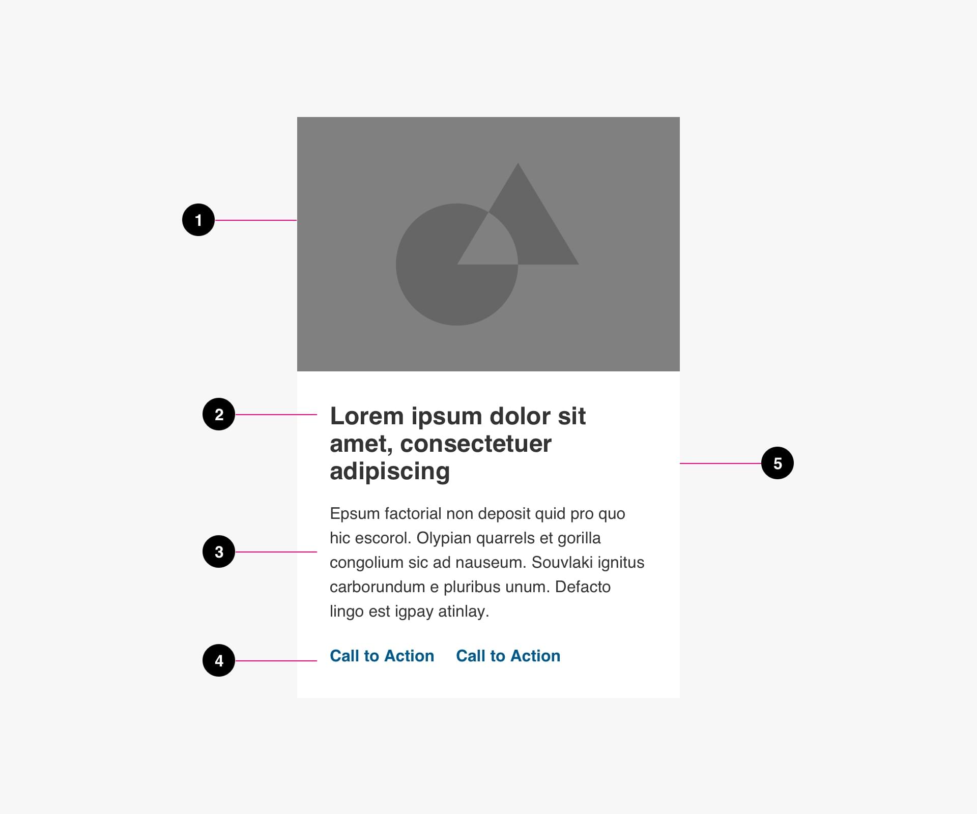
- Image (optional)
- Title (required)
- Supporting text (optional)
- Buttons (optional)
- Container (required)
Specs
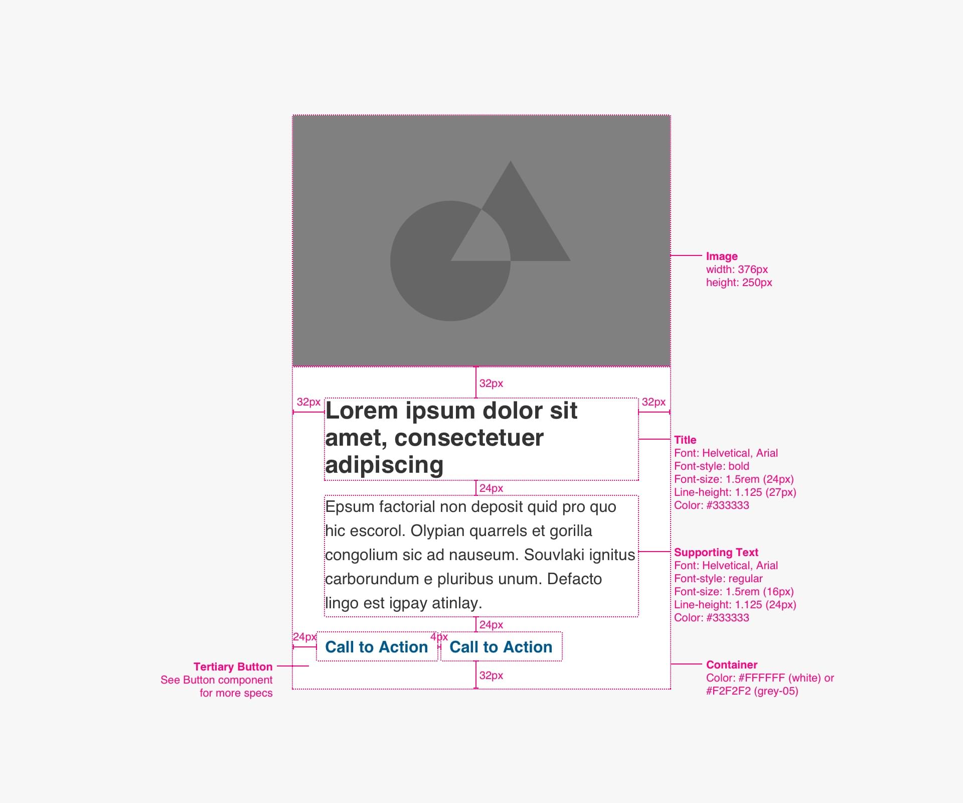
Code
Use the <article> element to denote your card as a standalone element within the body of your page.
<article>
  <a>
    <img>
    <h3>Heading</h3>
  </a>
  <p>Description</p>
</article>
Event Card
Anatomy
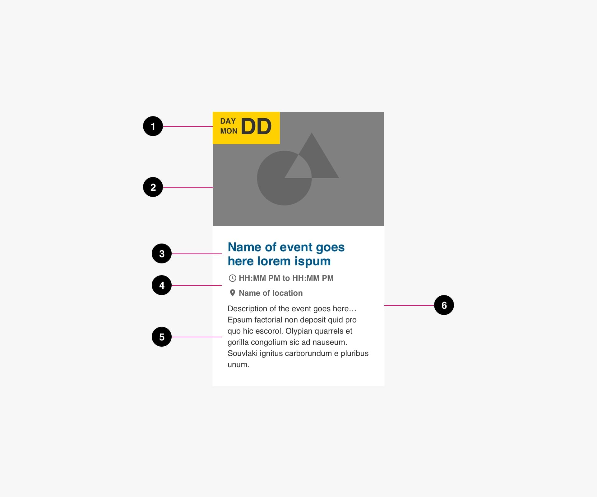
- Date (required)
- Image (required)
- Title (required)
- Time and Location (required)
- Description (optional)
- Container (required)
Specs
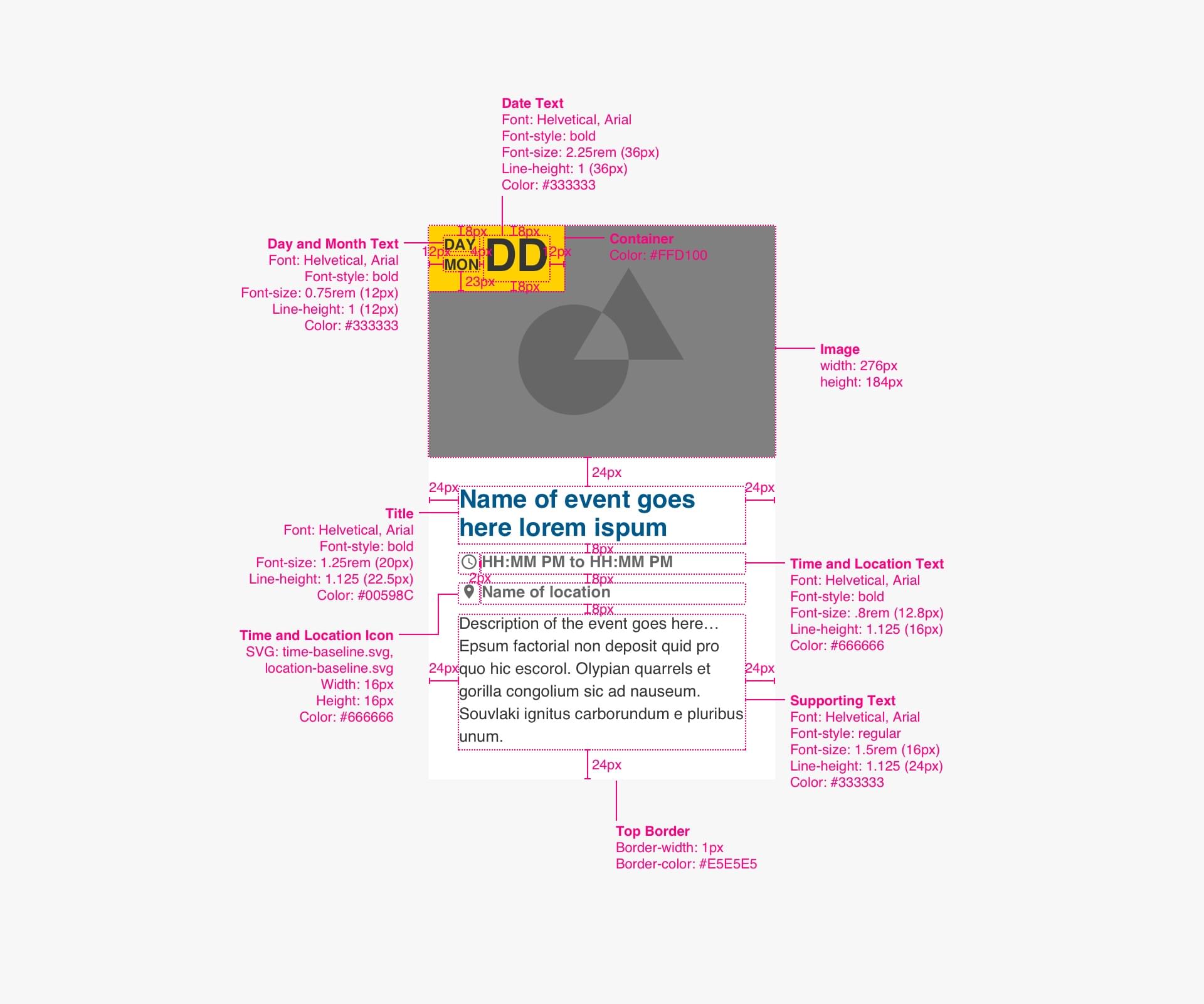
Code
Use the <article> element to denote your card as a standalone element within the body of your page.
<article>
  <a>
    <span aria-hidden="true">...</span>
    <img>
    <h3>Heading</h3>
  </a>
  <date>Date<br>Time</date>
  <span>Location</span>
  <p>Description</p>
</article>
Featured Story Card
Do’s and Don’ts
Do’s
- Only use one Featured Card per section.
Don’ts
- Don’t stack multiple Featured Cards in one section.
Anatomy
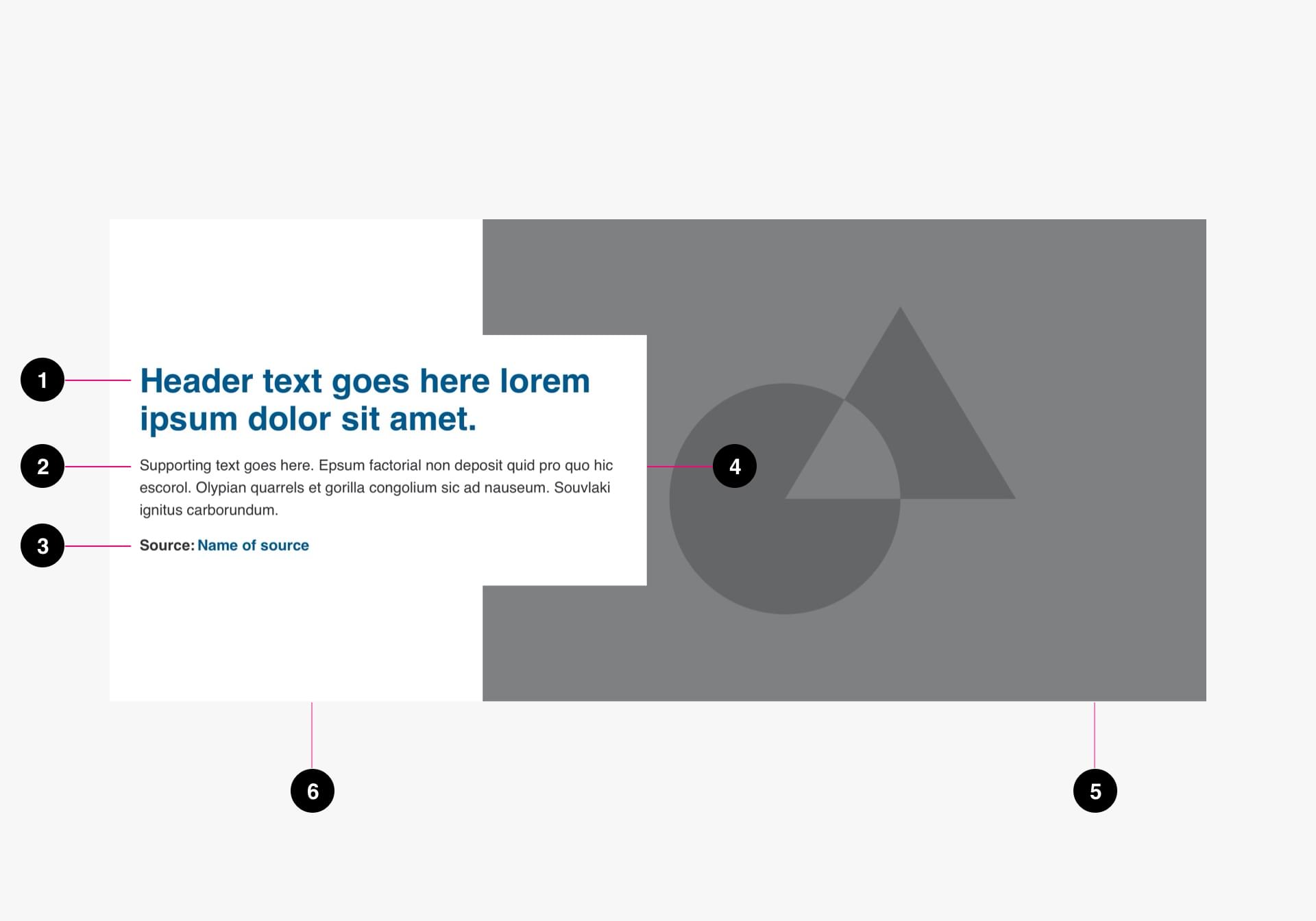
- Title (required)
- Supporting text (optional)
- Source (optional)
- Text Container (required)
- Image (optional)
- Background (required)
Specs
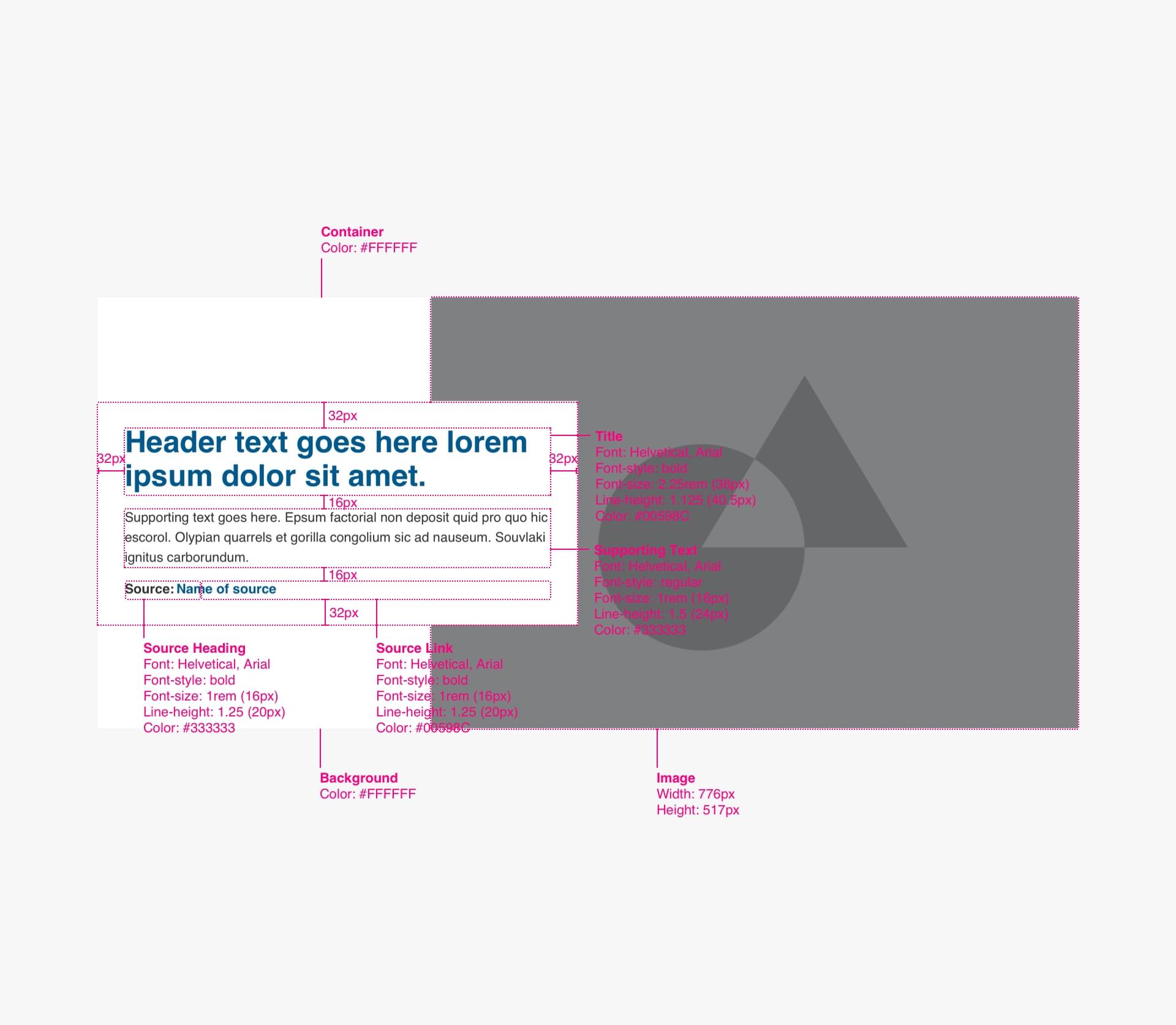
Code
Use the <article> element to denote your card as a standalone element within the body of your page.
<article>
  <img>
  <h3><a>Heading</a></h3>
  <p>Date<br>Time</p>
  <span>Source: <cite><a>Name of Source</a></cite></span>
</article>
Story Card
Anatomy
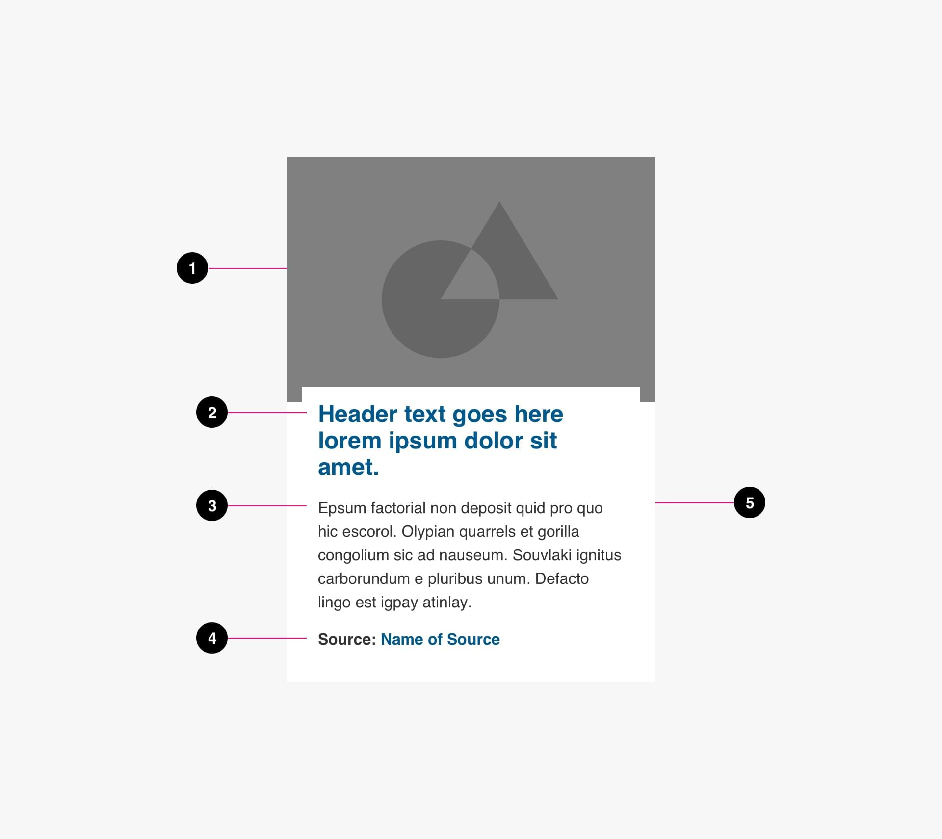
- Image (optional)
- Title (required)
- Supporting text (optional)
- Source (optional)
- Background (required)
Specs
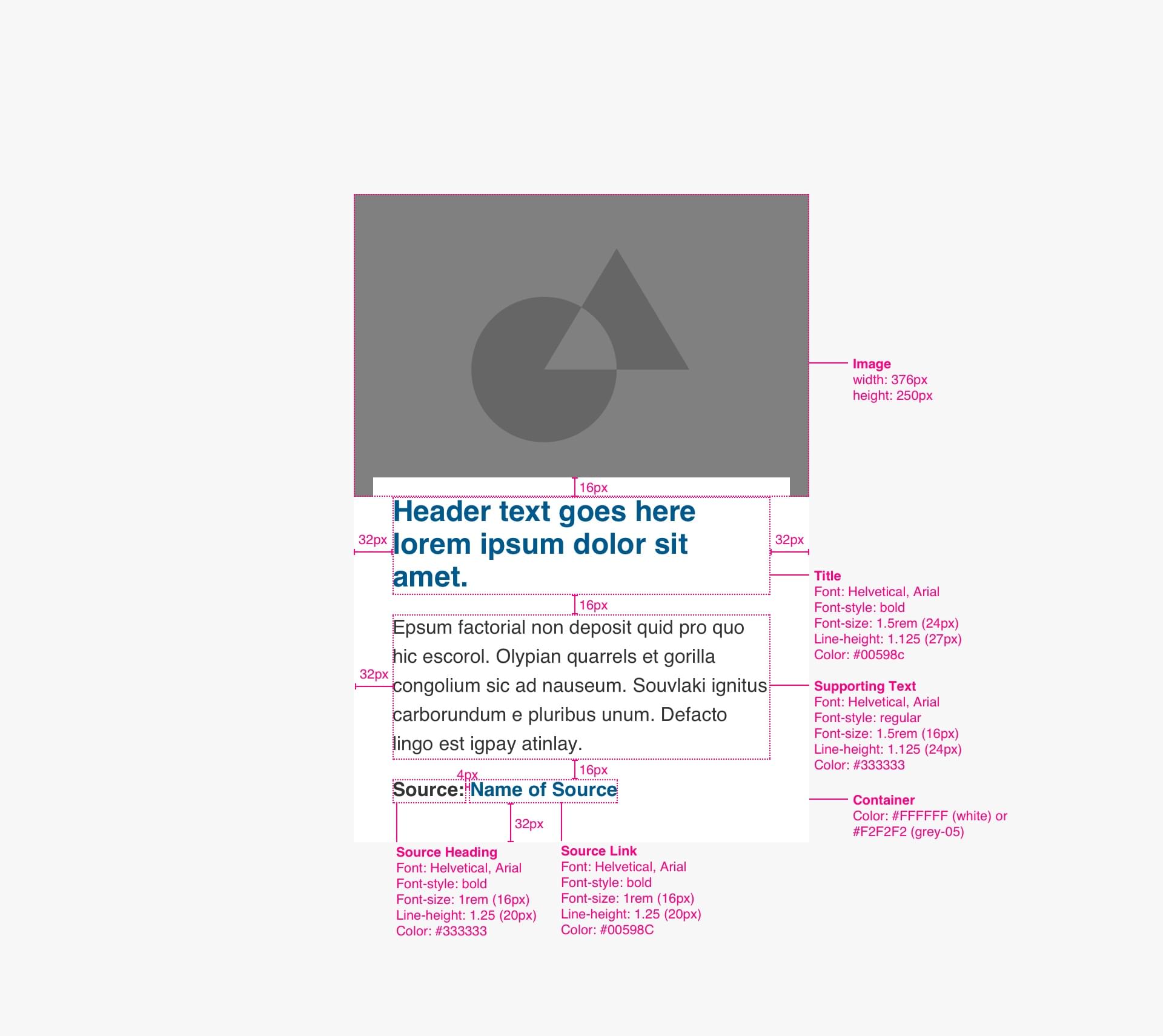
Code
Use the <article> element to denote your card as a standalone element within the body of your page.
<article>
  <a>
    <img>
    <h3>Heading</h3>
  </a>
  <p>Description</p>
  <span>Source: <cite><a>Name of Source</a></cite></span>
</article>
Person Card
Anatomy
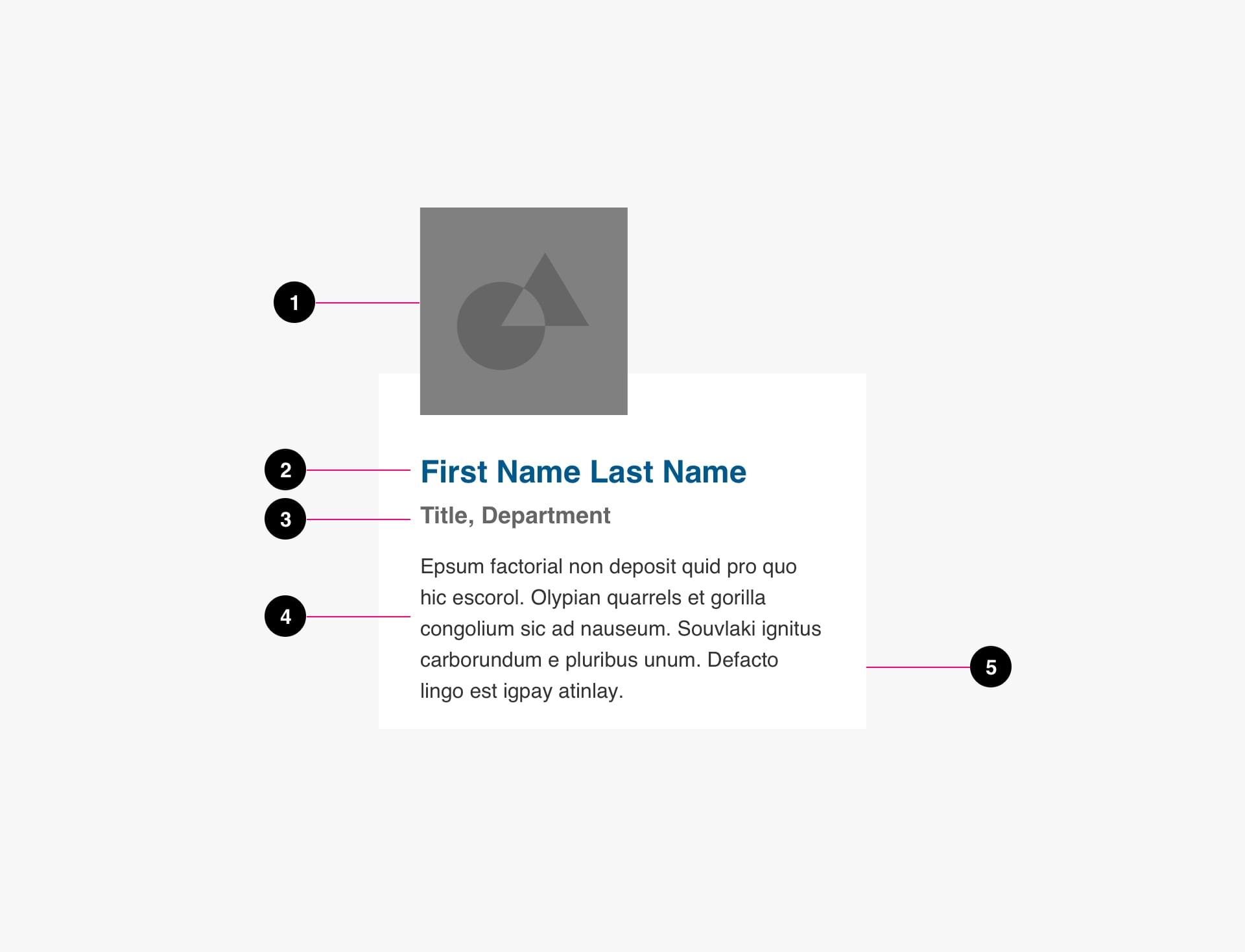
- Image (optional)
- Title (required)
- Supporting text (optional)
- Source (optional)
- Background (required)
Specs
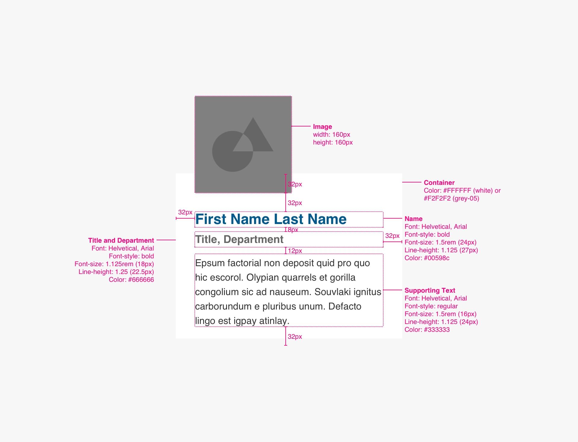
Code
Use the <article> element to denote your card as a standalone element within the body of your page.
<article>
  <img>
  <h3><a>Name</a></h3>
  <span>Title, Department</span>
  <p>Description</p>
</article>